| Image |
Comment |
| 04/27/2005 12:11:31 AM |
|
 Photographer found comment helpful. Photographer found comment helpful. |
| 04/26/2005 11:44:21 PM |
Gruenby graphicfunkComment by neophyte: Very crisp and fantastic comp. Text is wordy and vague and also seems tilted. but the font and color are perfect. Nice match on the background color. Overall a very good job. |
| Photographer found comment helpful. |
| 04/26/2005 09:15:33 PM |
|
| Photographer found comment helpful. |
| 04/26/2005 08:24:05 PM |
Gruenby graphicfunkComment by bcoble: Excellent photo. Being a collector of vintage watches, I was attracted to this.
Well done. The only issue would be the choice of background color. |
| Photographer found comment helpful. |
| 04/26/2005 04:12:51 PM |
|
| Photographer found comment helpful. |
| 04/26/2005 01:45:13 PM |
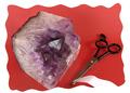
Gaudyby graphicfunkComment by sabphoto: While the rock is actually pretty big the way it is sitting seems out of proportion with the scissors. You've got a small part of the rock bottom cut off by the border, it probably would have been better cutting off a larger section of it or none at all. I see where you were going with the paper in the scissors but not sure it works. Good luck |
| Photographer found comment helpful. |
| 04/26/2005 01:27:58 PM |
|
| Photographer found comment helpful. |
| 04/26/2005 07:55:12 AM |
Gruenby graphicfunkComment by shareinnc: There's something about the red band and background that is too overpowering. My first impression of the "ad" is red, not jewelry (watch). |
| Photographer found comment helpful. |
| 04/26/2005 03:42:30 AM |
Gaudyby graphicfunkComment by fstopopen: nice lighting. good eposure. the border seems strange to me. I have a hard time getting perspective. |
| Photographer found comment helpful. |
| 04/25/2005 11:27:20 PM |
Gaudyby graphicfunkComment by mightythor: I really like your picture, I like how you put everything together. The colors are great. |
| Photographer found comment helpful. |
Home -
Challenges -
Community -
League -
Photos -
Cameras -
Lenses -
Learn -
Help -
Terms of Use -
Privacy -
Top ^
DPChallenge, and website content and design, Copyright © 2001-2026 Challenging Technologies, LLC.
All digital photo copyrights belong to the photographers and may not be used without permission.
Current Server Time: 06/12/2026 06:18:34 PM EDT.