| Image |
Comment |
| 04/04/2006 07:52:00 PM |
Hope in a Prayerby chookieComment by chrisymurph: I apologise for my last comment, wasn't very helpful was it?
More detail:
I'm afraid i must disagree with a previous comment that the background elements are too distracting (its my opinion, may not be right). I think it adds to the reality of the photograph. If there was just a plain white colour in the background, for example, it would not have given it a religious and genuine feel. SO well done again. |
| 12/20/2005 08:01:06 AM |
|
| 11/30/2004 08:22:45 PM |
Residents Onlyby chookieComment by pogopog: This, to me, is one of the many sign shots that could be helped by having a person in it. Perhaps the manager (male or female) standing to the side of the sign, looking at the camera; arms folded... (?) |
| 11/30/2004 06:23:46 PM |
Residents Onlyby chookieComment by Mark of SRQ: Fits the challenge. But bit of a dull shot. Perhaps if there was someone in the pool, or more colors maybe. Tough to make this one interesting. But at least it fit the challenge. |
| 11/27/2004 06:18:36 AM |
Residents Onlyby chookieComment by Skip: while this is a technically proficient shot (focus, lighting, dof are are fine) that definitely meets the challenge, it has no "wow" that takes it beyond being a good documentary shot. i know it's not always easy, but this is where the use of models (such as conscripting available children) can really make a couple points difference in your score. imagine how much more dynamic this shot would be if it had a couple dejected looking children looking standing in front of the sign... |
| 11/26/2004 03:29:38 PM |
|
| 11/24/2004 05:37:08 AM |
|
| 11/24/2004 01:58:16 AM |
Residents Onlyby chookieComment by snackwells: I think this fits the challege theme, but the composition suffers. I would have tried to shoot from a higher vantage from further away to get a clearer shot of the pool.
|
| 11/24/2004 12:26:43 AM |
Residents Onlyby chookieComment by vontom: I'm not sure, but the text, and top of the gate, seems just the tiniest out of focus, or at least my eyes think they are. I think the sign, certainly important, may be too important, not revealing enough of the scene. |
| 11/23/2004 11:59:08 PM |
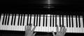
Pianoby chookieComment by bledford: As the viewer, I'm too removed from the scene. Get closer...closer still. Not close enough...closer.... :) |
Home -
Challenges -
Community -
League -
Photos -
Cameras -
Lenses -
Learn -
Help -
Terms of Use -
Privacy -
Top ^
DPChallenge, and website content and design, Copyright © 2001-2026 Challenging Technologies, LLC.
All digital photo copyrights belong to the photographers and may not be used without permission.
Current Server Time: 07/02/2026 02:08:15 PM EDT.