| Image |
Comment |
| 09/17/2002 08:35:00 AM |
|
| 09/17/2002 08:19:00 AM |
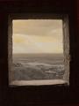
The Windowby MartinComment by sulamk: Composition: changing this to sepia spoils this very nicely composed shot 8 Lighting: I get the feeling the exposure of the sky was out on this shot 5 Appeal: 8, Total Rating 7 Sulamk |
| 09/17/2002 12:04:00 AM |
|
| 09/16/2002 11:52:00 PM |
|
| 09/16/2002 11:00:00 PM |
The Windowby MartinComment by labrynthe: I really like this image. Good composition, the proper use of lighting I think created a dramatic effect on the subject. This looks like a classical painting. - labrynthe |
| 09/16/2002 08:39:00 PM |
|
| 09/16/2002 07:22:00 PM |
The Windowby MartinComment by lmhr: very cool use of - space. it's a shame u couldn't get more color in there. |
| 09/16/2002 04:44:00 PM |
The Windowby MartinComment by Gracious: What an ancient look to this! Very nice indeed. There appears to be some over saturation in the sky that doesn't look natural. Good luck in the challenge...it's a tough one! Grayce aka Gracious |
| 09/16/2002 03:28:00 PM |
|
| 09/16/2002 03:27:00 PM |
|
Home -
Challenges -
Community -
League -
Photos -
Cameras -
Lenses -
Learn -
Help -
Terms of Use -
Privacy -
Top ^
DPChallenge, and website content and design, Copyright © 2001-2026 Challenging Technologies, LLC.
All digital photo copyrights belong to the photographers and may not be used without permission.
Current Server Time: 07/18/2026 05:30:35 AM EDT.