| Image |
Comment |
| 09/04/2004 09:06:14 AM |
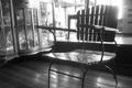
úpúanby potogComment by rachelr_ph: hey, i like the chair. it looks antique coz of the shine and materials used. seems like its more or less 10 years old. the shape is comfortable for the seater. is it ur favorite chair? |
| 08/03/2004 11:11:54 PM |
úpúanby potogComment by rgordon: This is a great shot but is marred by compression artifacts. Keep an eye out for a new tutorial coming soon to this site that will provide tips on how to save your image with the best possible quality while still keeping it under 150 KB in size (per challenge requirements). |
 Photographer found comment helpful. Photographer found comment helpful. |
| 08/01/2004 05:35:46 AM |
úpúanby potogComment by neehai: I'd have preferred to see less clutter in the background, since it takes the eye from the wonderful shape of the chair. Nice attempt, though. |
| Photographer found comment helpful. |
| 07/30/2004 07:18:13 PM |
úpúanby potogComment by morpurgo: Great with the backlight can you tell me how you chouse your lighting? |
| Photographer found comment helpful. |
| 07/30/2004 03:59:21 PM |
úpúanby potogComment by Kylie: This has a very classic feel to it; one of my favorites in this challenge. |
| Photographer found comment helpful. |
| 07/28/2004 12:16:28 PM |
úpúanby potogComment by taterbug: I looked at this for quite some time thinking about it. I like it overall. It seems pretty interesting. I like the compostion and your subject. It seems that you wanted to capture the bright sunlight from the window, that's what I had to think about. It is a nice effect, I like it behind the chair back, but I feel it kind of washes out a lot of the other background, and with it you lose some of the right side of the chair. Perhaps a little bit different time of day would still use that light, but differently? |
| Photographer found comment helpful. |
| 07/28/2004 08:02:47 AM |
|
| 07/24/2004 10:42:41 PM |
|
| 07/20/2004 10:38:26 PM |
bibliyaby potogComment by adine: I like the golden color and the rays of light across the page. But the words are out of focus, and we cannot see the texture of the page or get any context of where this bible is or what we should think about it. Perhaps a hand pointing out a special passage, or an object that relates to the text? |
| Photographer found comment helpful. |
| 07/20/2004 06:46:02 PM |
bibliyaby potogComment by Soleil9: Dramatic lighting, you almost have it!!! It's only a bit out of focus, if it were sharper, it's be more effective. |
| Photographer found comment helpful. |
Home -
Challenges -
Community -
League -
Photos -
Cameras -
Lenses -
Learn -
Help -
Terms of Use -
Privacy -
Top ^
DPChallenge, and website content and design, Copyright © 2001-2026 Challenging Technologies, LLC.
All digital photo copyrights belong to the photographers and may not be used without permission.
Current Server Time: 07/16/2026 08:07:22 PM EDT.