Forgotten Heroesby
kirtiebuComment by e301: From the Critique Club
Hi Kirsty
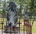
There are some very odd moments of light in this shot, which make it seem most bizarre. The paaterns of greys on the gravestones, together with the obvious fact that the light is falling from behind them, gives me the impression that they have been selected individually and brightened and added contrast quite heavily, with the effect that they've been made to seem completely disconnected from the rest of the image. I'm not completely sure that's the case, but in the absence of any image information from you it's very difficult to do other than guess.
It's generally considered good form to write something about the process of taking the image in your comments, especially if you're asking for a critique: mainly though it helps you: lets us know what you've done, what you were trying to achieve and so on.
There is some sense of strong composition here - the two stones placed strongly on the thirds lines, giving a balance to the image. There are, however, a bunch of other things that I think could be improved enormously, with a noticeable improvement in your score.
Firstly is the idea of the overall scene. Fine, you've found a subject, and found an angle to shoot it from that gives it some strength. Howewver that point of view is pretty 'normal' - it appears to be a head-high shot, exactly the kind of view we see all day. part of what a shot needs to be eye-catching is an unusual point of view - be it a scene we never see, or a familiar scene from an (even slightly) different angle. Of course, one can go too far with that, but there is a balance to be struck.
Your background: the line of that path, and fence, and the buildings beyond passes absolutely through the middle of the shot, and strongly distracts attention from your subject. This also ties in to the previous point - but if you'd been able to frame the stones simply against the trees (and your camera has the necessary zoom to have shot from further away to make that easier), you would have far stronger image. that line, and that shaping of your image, makes for a very messy complitation - lots of strange lines in the trees, the lines of the fence, the definite lines of the building ...
Light: the whole thing is too damn bright - so that your background is brighter lit tthan your subject. This can be dealt with in processing, but even better would be to wait for a different moment of light, so that the stones are naturally lighter against the background. There's a strong sense that this is taken with the exposure your camera tells you is right - it has that overly bright feel to it that is the usual result of that. Well here's something: the camera is almost always wrong in this case. It almost always tells you to overexpose an image by a considerable amount. If you use the EV settting at something like -0.6, or one stop's worth of shutter speed faster than you're using, you'll find the colours and tones of your scene will have so much more impact: of course, if anything feels too dark, you can always lighten it later.
There's almost nothing here that is actually black - and that range from black to white is all that you have to play with. Take a look through the photos of the site's top favourite photographers - you'll see that they all use black much more strongly than you have here. it gives a much stronger sense of the bright areas if there is more darkness to contrast with them.
Light is also a matter of bringing out texture in your shots: here, it seems very direct, very harsh, especially on the rusted railings - it feels like a midday shot, which is rarely a good time to shoot this stuff. Later, or earlier in the day, when the light is softer, from a lower angle, I think you'll find that it brings so much more life to your subjects. If you cold have got the shot with the light just skiimming the front of the stones, all the different textures would spring out, all the real depth of the carvings on the stones - there would be so much more sense of three dimensions to this.
Well, I've gone on at some length. I hope some of that isn't taking down at you - but it seems to me that these are the things that hardl ever get mentioned in comments, and yet are more often than not the things that lead to scores in the 4.somethings. They're quite easily fixed, once one knows what they are.
Hope that's of some use
Ed