| Image |
Comment |
| 05/28/2008 02:41:41 AM |
at 29by jdannelsComment by Art Roflmao: Wow! So many lackluster entries in this challenge - a few stand out as outstanding, this is one of them. An easy 10 from me.
ps: get a haircut, hippie! |
 Photographer found comment helpful. Photographer found comment helpful. |
| 05/28/2008 02:38:22 AM |
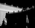
Shadows in the Sunby jdannelsComment by littlegett: What I notice first is the incredible amount of black 'whitespace' in the image. However one aspect I can say I enjoy about it is the way the shadows of the railing nearly line up perfectly with the railing itself.
The black sky and railings I like, however what I believe to be the downfall of the image is the complete lack of hints/detail within the bottom area. I can see the table umbrella, however it could also easily be a man/woman in an over coat. It could also be a rocket ship or a jacket on a coat rack or even a cowboy wearing a duster.
The ball on the 'banister end for lack of a better term' seems to be out of place or just abstractly there.
Now with the very small amounts of highlights here and there it makes for this area of the image to be very confusing and very unappealing. To me, I would much rather have a 'hint' of detail than complete lack of with only specks to show something may or maynot be there.
I do enjoy the high contrast nature of the walls/railing against the black sky/shadow. However the dark edge of the building and the mystery specks just don't do it for me. Now I sound like I am repeating myself L()L.
I keep wanting to look deeper and figure out what everything is. From what I can see the specked area is obviously a tree, though it seems to have lights or glitter on it. The line between the tree and umbrella is an indoor florescent tube. The far right is foliage that got in the image with light on it. The white square to me seems like it was an opening or hole in the wall where light went through and hit the other wall.
Over all I really enjoy the concept and contrast, just wish there was a bit more underneath.
Andrew |
| Photographer found comment helpful. |
| 05/28/2008 12:09:25 AM |
|
| Photographer found comment helpful. |
| 05/27/2008 08:53:32 PM |
Brothersby jdannelsComment by kolasi: I dont know why I like this, but I do.
Had to search around to find everything, but thats a good thing in this case |
| Photographer found comment helpful. |
| 05/26/2008 03:19:52 PM |
Brothersby jdannelsComment by nikolaos: Where did he landed ? :)
The high contrast from the harsh light looks interesting.
|
| Photographer found comment helpful. |
| 05/26/2008 01:08:16 PM |
still hangin aroundby jdannelsComment by Yo_Spiff: I guess I should have left a little more analysis with my in-challenge comment. I did give it a 6. I think the main issues that held it back were probably the tilt and the lighting was ok, but not the best for the subject. I also agree that the slight sepia tone didn't come off well. I would have played off the contrast of the black and silver. |
| Photographer found comment helpful. |
| 05/26/2008 02:13:27 AM |
still hangin aroundby jdannelsComment by undieyatch: I think this is fabulous, it was my first camera & given to me by my mother - I am sure I still may have it, but I doubt if I will ever bother to dig it out. This photo is a wonderful reminder of all those hundreds of terrible drug store processed vacation pictures I made with it. |
| Photographer found comment helpful. |
| 05/26/2008 01:14:47 AM |
still hangin aroundby jdannelsComment by littlegett: Looking at this image, straight away I notice it is a bit canted to the side and not level with the edge or parallel to the ground. A bit rotation in post or a reposition in capture would fix that easily.
Next, I enjoy the placement of the subject as well as the bottom plank. I believe it adds an extra depth and feel to the image.
I feel the sharpness and focal points of the image are strong on the subjects edges. Though with the flash disk there is a loss because of the smoothness of the disk.
The sepia tones I do not believe work well for this image, or they were not pushed enough, they seem a bit off tone. Though one thing that makes this image difficult to light is because of the large silver area and the blacks. Which create hot highlights within the tones. I am wondering how this would have been straight b/w without the sepia tone.
Overall I felt this was one of the better images because it focused on the subject without a lot of added flash and bang. However, the dish really distracts me.
I wonder, What if you used two lights from the rear, one on each side at a 45 degree, than use a pin-point light for the face plate but not hitting the dish, Than also another pin point light turned way down at a slight front angle, a bit more than your front light to light the dish. This should create strong highlights on the edges of the subject, as well as gain more control over highlights and shadows along the difficult silver and black combinations.
Andrew |
| Photographer found comment helpful. |
| 05/26/2008 12:49:26 AM |
still hangin aroundby jdannelsComment by Melethia: Not entirely sure why this scored and placed where it did. No gimmick? Technically perfect. And I never had one of these so it's neat to be able to see all the detail and wonder about the fun and enjoyment it gave someone. I like the B&W versus color option. Nice built-in diffuser, too. :-) |
| Photographer found comment helpful. |
| 05/25/2008 09:42:48 PM |
|
| Photographer found comment helpful. |
Home -
Challenges -
Community -
League -
Photos -
Cameras -
Lenses -
Learn -
Help -
Terms of Use -
Privacy -
Top ^
DPChallenge, and website content and design, Copyright © 2001-2026 Challenging Technologies, LLC.
All digital photo copyrights belong to the photographers and may not be used without permission.
Current Server Time: 06/26/2026 10:49:41 PM EDT.