| Image |
Comment |
| 08/12/2002 06:46:00 PM |
|
 Photographer found comment helpful. Photographer found comment helpful. |
| 08/12/2002 05:26:00 PM |
|
| 08/12/2002 04:16:00 PM |
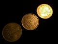
Monetary Reformsby stephanComment by focus: I think there were two ohter coin submissions. Yours stood out because of the excellent lighting. You made your point without my having to read your caption. |
| Photographer found comment helpful. |
| 08/12/2002 03:28:00 PM |
Monetary Reformsby stephanComment by ron: Lighting a bit too extreme on the edges (too dark, too light) but I love the idea and composition. |
| Photographer found comment helpful. |
| 08/12/2002 11:26:00 AM |
Monetary Reformsby stephanComment by tunnard: shows the transition from old to new. nice, i like the way the light shows the new stuff, and gets darker towards the old. |
| Photographer found comment helpful. |
| 08/12/2002 05:41:00 AM |
Monetary Reformsby stephanComment by rocco22: I did this ide also but didn´t post it because i didn´t like it in the end, Your is better then mine was but to much hot spots on the Euro coin. rate it 2 |
| Photographer found comment helpful. |
| 08/12/2002 09:00:00 PM |
2nd/3rd century ADby stephanComment by stephan: I find the diversity of opinions very interesting... If I count how many people like the lighting (counting me in) and how many think it's too dark it's 9 to 9. I'm not sure what to do now ;-) After reading floyds comment I also see that the photo would have looked better when the light was more evenly distributed. The direction of the light was not under my control as the statue is in a museum and I think they wouldn't be very happy if I would have started to adjust the lamps ;-) Personally I liked the photo for the strong shadows and to me it looked almost like the statue "beholds" me. That was also the reason why I cropped it that way. To me the statue looks down at me and somehow I liked this effect. Anyway, many thanks for your comments. As always, most welcome :-) |
| 08/11/2002 10:30:00 PM |
|
| Photographer found comment helpful. |
| 08/11/2002 03:09:00 PM |
|
| Photographer found comment helpful. |
| 08/11/2002 10:46:00 AM |
2nd/3rd century ADby stephanComment by MaYz: Very nice. I like the positioning of the statue, a position in the middle would have been as perfect. The lighting is also great, the shadows are really nice. |
| Photographer found comment helpful. |
Home -
Challenges -
Community -
League -
Photos -
Cameras -
Lenses -
Learn -
Help -
Terms of Use -
Privacy -
Top ^
DPChallenge, and website content and design, Copyright © 2001-2026 Challenging Technologies, LLC.
All digital photo copyrights belong to the photographers and may not be used without permission.
Current Server Time: 07/16/2026 10:10:23 PM EDT.