| Image |
Comment |
| 08/17/2002 05:17:00 PM |
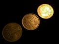
Monetary Reformsby stephanComment by Remie: Good idea to show the transition from the old Mark to the new Euro in steps and the black background is great. Instead of being only darker and brighter, I wished the old Mark would llook really old and the Euro really shiny new though. |
 Photographer found comment helpful. Photographer found comment helpful. |
| 08/16/2002 07:17:00 PM |
|
| Photographer found comment helpful. |
| 08/16/2002 10:38:00 AM |
|
| Photographer found comment helpful. |
| 08/15/2002 04:03:00 PM |
|
| Photographer found comment helpful. |
| 08/15/2002 10:00:00 AM |
Monetary Reformsby stephanComment by courtenay27: This is a good idea for a photograph but I have some suggestions that may give the idea more impact. First, the higlights on the euro are too bright and drown out a bit of the detail. Plus, to enhance the idea, you might try reversing the order of arrangement putting the euro up front and the mark in back to emphasize the age. I would also try (and you may have experimented with it) lowering the angle of view to give a more 3d perspective instead of an overhead shot and decreasing the aperture to further blur the trailing two coins. Also try standing or propping them up in a domino-like procession if you lower your angle of view. I do still like your idea though. Score: 4 Courtenay |
| Photographer found comment helpful. |
| 08/15/2002 09:54:00 AM |
|
| Photographer found comment helpful. |
| 08/15/2002 02:02:00 AM |
Monetary Reformsby stephanComment by HBunch: I like this, and I like how you have the newest coin lit, second partially lit and oldest somewhat dark. What could have made this better is if the coins were all laying in the same direction. They seem to be staggered. Also, the photo doesn't appear to be a direct shot from the top, it looks like it was taken at a slight side angle, this making the coins not look completely round, but somewhat "squished" looking. If you aren't quite sure what i'm talking about...a pringles can lid (those are potato chips just in case you don't have them where you're from) is the exact same size as the oldest coin in your photo. This is, if the photo is in the large form as seen on this commenting page. If you place the pringles lid over the oldest coin directly onto the computer screen, you can see that the coin does not appear to be perfectly round, implying that the photo was taken at a slight angle. Now, I KNOW this is VERY picky, but maybe something to think about when taking pictures from the top. Setting my pickyness aside, I rated this photo high, and wish you the best of luck in the challenge. |
| Photographer found comment helpful. |
| 08/14/2002 11:11:00 PM |
|
| Photographer found comment helpful. |
| 08/14/2002 09:34:00 PM |
Monetary Reformsby stephanComment by psychephylax: Mmmm...Euro...I can see the progression from old to new monetary systems and the lighting helps to establish that. Like the abstraction and it's very original. |
| Photographer found comment helpful. |
| 08/14/2002 10:57:00 AM |
Monetary Reformsby stephanComment by vestanpance: Simple bug effective. Nice subject (gives a historical setting). The Euro is shiny, the Euro is New, the Euro best! Good color for such a simple subject. |
| Photographer found comment helpful. |
Home -
Challenges -
Community -
League -
Photos -
Cameras -
Lenses -
Learn -
Help -
Terms of Use -
Privacy -
Top ^
DPChallenge, and website content and design, Copyright © 2001-2026 Challenging Technologies, LLC.
All digital photo copyrights belong to the photographers and may not be used without permission.
Current Server Time: 07/16/2026 09:32:13 AM EDT.