| Image |
Comment |
| 11/15/2004 06:15:18 AM |
First Impressionby JeanComment by Pug-H: I like the photo but I don't feel that it fits into the Impressionist school - it's much more of a 20th Century art movement than 19th. |
 Photographer found comment helpful. Photographer found comment helpful. |
| 11/15/2004 04:28:50 AM |
|
| Photographer found comment helpful. |
| 11/15/2004 02:01:00 AM |
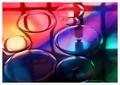
First Impressionby JeanComment by ursula: Hmmmm ... this looks like a "Jean" picture - the colours are absolutely lovely, as is the soft clarity of the picture. This is probably my favourite entry to the challenge, overall. And, whoever took this picture, I hope you don't mind if I talk just a little bit about two things that bother me: (1) the white edge of the oildrop to the left merging into the border - doesn't quite merge, but merges enough to be a little distracting; (2) the square arrangement of the window frame reflections - I was just wondering what the picture would look like if those darkish shadows (reflections) would be at more of a right angle to the diagonal colour lines - maybe that would make it too set-up looking, I don't know, but the combination of diagonals and squared off is throwing my eyes for a bit of a loop.
But, I think it's a lovely picture, with a good impressionistic mood, a moment of light and colour. 9 from me.
And, if this is a Jean picture, please do not be offended by my nitpicks above - I admire Jean's work tremendously. If it's someone else's picture, please take all of this as a compliment. |
| Photographer found comment helpful. |
| 11/15/2004 01:37:46 AM |
|
| Photographer found comment helpful. |
| 11/15/2004 12:40:15 AM |
First Impressionby JeanComment by annasense: This is a stunning piece of artwork... truly. I don't know enough about impressionism to know if this totally fits the challenge (obviously, to me, it doesn't), but I'm not going to let my ignorance hurt this lovely photo. I can't wait to see how it was done!! Oh, and you should definitely make this a print or sell it as fine art.
Coming back and changing my thinking... I just read up a little about impressionism... and I just don't see how this is an impressionist piece. I *want* it to be impressionist, so I can give it a 10 because it's so cool... but I really don't think I can... I've got to change my score, I'm sorry. It's the best photo in the challenge, I just don't think it quite fits the challenge. I normally give those a 4, but I can't do that to this piece. 8 |
| Photographer found comment helpful. |
| 11/15/2004 12:29:09 AM |
First Impressionby JeanComment by Cantique: Love the colors and patterns in this. It looks a bit more like modern art than impressionism but never mind. It is great. |
| Photographer found comment helpful. |
| 11/14/2004 07:52:52 PM |
Julyby JeanComment by snackwells: This image lacks pop...too subdued by what I suspect to be aggressive burning in the upper third of the shot. Otherwise it would be a fantastic July candidate. |
| Photographer found comment helpful. |
| 11/13/2004 11:36:21 PM |
Julyby JeanComment by Tressider: Would be much better with more of the beach cropped and not so much sky. |
| Photographer found comment helpful. |
| 11/13/2004 09:36:32 PM |
Julyby JeanComment by Brad: Stunning color level & composition.
Perfect take on the challenge! |
| Photographer found comment helpful. |
| 11/13/2004 06:45:23 PM |
|
| Photographer found comment helpful. |
Home -
Challenges -
Community -
League -
Photos -
Cameras -
Lenses -
Learn -
Help -
Terms of Use -
Privacy -
Top ^
DPChallenge, and website content and design, Copyright © 2001-2026 Challenging Technologies, LLC.
All digital photo copyrights belong to the photographers and may not be used without permission.
Current Server Time: 06/04/2026 02:06:25 PM EDT.