| Image |
Comment |
| 06/30/2005 01:14:28 PM |
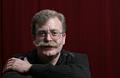
Peteby KiwiChrisComment by Jutilda: Nice natural shot. Maybe lose a tad of the surround area and zoom in on his face. I like the shadow on the left of the photo. |
 Photographer found comment helpful. Photographer found comment helpful. |
| 06/30/2005 10:42:23 AM |
smimg_2904.jpgby KiwiChrisComment by Sonifo: Nice composition and lighting. Maybe a small amount of light on the left side to light up his face just a bit more. |
| Photographer found comment helpful. |
| 06/30/2005 07:43:38 AM |
Peteby KiwiChrisComment by suemack: I really like his pose....he looks comfortable, relaxed, yet is directly looking towards the camera. Get a real sense of his personality, good humour from this shot.
Well done in making your model feel relaxed enough to get this sort of pose. Lighting, dof and colours are great. Agree with Kevin about the line in the drapes, it draws the eye. |
| Photographer found comment helpful. |
| 06/30/2005 07:22:31 AM |
Peteby KiwiChrisComment by KevinRiggs: I like the gradual slide in tones across the background but this has a few little things that aren't bad but just some things you could consider. The subject stands out from his direct background just fine. Great job on that part. I see a vertical line of light farther to the image right, just beside the seam of the backdrop. This seems just a little contentious and I think you could easily burn that or heal it out of the shot along with the seam and just see how much of a difference it makes. On the subject's face, I love the definition you captured here. The mustache and hairline really create some character that looks fun to work with. Under the subject's eyes, however, I see darkness with strong edges. I think I'd at least try a version of this where those dark edges were healed with a soft-medium edged healing brush. It wouldn't totally remove the dark areas (which I feel add some character) but it might keep them from being so prominent. I think this is added to since the catchlights are relatively small in the subject's eyes (and I'm sure that's a function of you trying to keep the glare out of the glasses). The one thing I notice that you can't go back in processing to work on is the hand. Its fine that he has one hand up and (I presume) the other hand down. It does invite the viewer to consider whether he lost his hand and how. Neat if what you wanted was to intrigue your viewers. If, on the other hand (please pardon the pun), what you wanted was a good representation of the subject for family or professional work then I would think that keeping the viewer drawn up to that face with al its texture and lines and hairy hair hair, you might just have wanted a little of the subject's right hand to appear so that the viewer "felt" the symmetry without having to look down and wonder about the hand. Not a major issue; you've covered the major point of the subject by capturing his face well; maybe its just something to consider next time you look through the lens for a shot like this.
Oh yeah. I like your compositional idea here to move him off to the side. Were it me, I might have cropped the image a little taller to get his face closer to teh intersection of the top and left thirds lines but I'm afraid that such a cropping would lose the impact of having that face so prominently displayed. That's the trade off you have to try and then decide what you like. All-in-all, I like how you composed/cropped this shot, though.
Nice job on this one, too.
Kev |
| Photographer found comment helpful. |
| 06/30/2005 07:10:59 AM |
smimg_2904.jpgby KiwiChrisComment by KevinRiggs: I like this image. Not too hot anywhere, crisp clarity in the face and the eyes. You might try burning the top where the light gray color is bright just so it doesn't compete with the face as much but a very good job as it sits right now. This has depth and tones; composition and execution. Very nice work.
Kev |
| Photographer found comment helpful. |
| 06/19/2005 10:35:28 AM |
|
| 06/18/2005 12:30:27 PM |
|
| 06/12/2005 02:32:41 AM |
Trailer Rideby KiwiChrisComment by Artyste: My suggestion was to mess with the contrast a little too. I think it would help bring out the "movement" aspect too. |
| 06/12/2005 02:11:01 AM |
Trailer Rideby KiwiChrisComment by oOWonderBreadOo: even with the camera shake this is a well composed photo and the important part-her face is in focus. Only thing I'd suggest is bumping up the contrast in her face and hair, which seems a little flat. |
| 06/06/2005 12:26:06 AM |
|
| Photographer found comment helpful. |
Home -
Challenges -
Community -
League -
Photos -
Cameras -
Lenses -
Learn -
Help -
Terms of Use -
Privacy -
Top ^
DPChallenge, and website content and design, Copyright © 2001-2026 Challenging Technologies, LLC.
All digital photo copyrights belong to the photographers and may not be used without permission.
Current Server Time: 07/16/2026 01:29:17 AM EDT.