| Image |
Comment |
| 12/16/2002 07:34:45 PM |
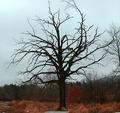
Dead Woodby LanSnakeComment by FranziskaLang: challenge met. the square format works well, and i like that you managed to find a location where you are able to show the whole tree, and not just its top w/out the "hand of man" intruding. i also like that the tree is almost a sillhouette, but there is still some detail visible. centering it worked well for this photo. just a nitpick, i would like to see the top of the tree, it looks like there's not that much more missing. overall, due to the weather (which is outside of your control, i know), the photo is just a little lacklustre in the color department. but, still a decent entry. :) |
 Photographer found comment helpful. Photographer found comment helpful. |
| 12/16/2002 04:22:55 PM |
Dead Woodby LanSnakeComment by kathleenm: I love how the top looks almost like a b&w then you get the burst of orange/red at the bottom. 6 |
| Photographer found comment helpful. |
| 12/16/2002 01:58:44 PM |
Dead Woodby LanSnakeComment by justine: Like the color at the bottom very much. Not crazy for the light, little dark and the focus is too soft for me. Also the tree is dead center, still this color is very good and I like that very much. |
| Photographer found comment helpful. |
| 12/16/2002 02:32:15 AM |
|
| 12/16/2002 12:26:17 AM |
Dead Woodby LanSnakeComment by Chaszmyr: The tree is a little too dark, I think. Also, I think it would look nicer if the top of the branch wasnt cut off. |
| Photographer found comment helpful. |
| 12/11/2002 02:04:38 PM |
Blue Sphereby LanSnakeComment by karmat: CRITIQUE CLUB CRITIQUE
by Karmat
(Note -- One of my favorites for the challenge!)
Composition -- I feel that you have effectively used the composition of this subject to create a balanced shot. The marble placed in the right third allows the "shadow" to go to the center, thus directing the viewer's eyes into the picture. I think cropping it the way that you have is also effective in that you didn't try to fit the whole shadow in, which may have made it seem "top heavy." Excellent choice of subject, and it fits the challenge very well. The "background" material is also interesting. If possible, it may have been interesting to let the little "holes" lead the eyes to the marble.
Technique -- To me, the focus works well in this shot. I know having a blurry foreground can be distracting to alot of people, but here I think it really makes the marble "pop." The reflection in the marble is interesting, but I found myself trying to see what was above the horizon in the reflection (or below it, I guess). Would it have been possible to "curve" the background material up so that only that would be reflected. That is obviously a personal preference, because I can see how the reflections add some interest.
Overall Effect -- I felt that this was an awesome photograph, and a creative idea. The simple colors and composition are eye-catching, and the whole pic works well, I think. Sorry I can't offer more "constructive criticism" but this is a good picture, that does not need a lot of work, I think! |
| Photographer found comment helpful. |
| 12/08/2002 11:23:06 PM |
|
| Photographer found comment helpful. |
| 12/08/2002 03:59:28 PM |
|
| Photographer found comment helpful. |
| 12/01/2002 10:15:07 PM |
Blue Sphereby LanSnakeComment by jmsetzler: Excellent shot... i love the lighting choice you have chosen here... I also like the texture and patterns on the surface... great shot :) - setzler |
| Photographer found comment helpful. |
| 12/08/2002 12:15:04 AM |
Blue Sphereby LanSnakeComment by PTLParsons: Like how the sphere picked up the pattern of the cloth it is on, and the pattern shows through the blue shadow. Nice cloth for a base, only thing is it goes out of focus to much to fast. Plain and simple and nice. Good job. PTL 7 |
| Photographer found comment helpful. |
Home -
Challenges -
Community -
League -
Photos -
Cameras -
Lenses -
Learn -
Help -
Terms of Use -
Privacy -
Top ^
DPChallenge, and website content and design, Copyright © 2001-2026 Challenging Technologies, LLC.
All digital photo copyrights belong to the photographers and may not be used without permission.
Current Server Time: 07/15/2026 04:34:10 PM EDT.