| Image |
Comment |
| 09/16/2002 08:29:00 PM |
|
| 09/16/2002 06:41:00 PM |
|
| 09/16/2002 06:34:00 PM |
|
| 09/16/2002 03:57:00 PM |
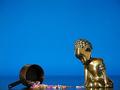
oops!by GinaRothfelsComment by justine: I think if you left the statue on the right out this would of had more impact. Just MHO. Good luck. Score 6 Justine |
| 09/16/2002 03:39:00 PM |
oops!by GinaRothfelsComment by HBunch: Cute. I like the reflections of the sprinkles and the statue in the "floor". The "negative space" here definately brings out the subjects. Really makes them stand out of the photo. The lighting is very nice, and the focus and clarity are good. I like the angle and framing also. Good luck in the challenge. ~Hbunch7187~ |
| 09/16/2002 12:04:00 PM |
|
| 09/16/2002 11:12:00 AM |
oops!by GinaRothfelsComment by inspzil: Maybe a little setup for my taste, but great color. Personally I would've moved the subjects up a bit. I don't think a little less of that lovely blue sky would've been missed. |
| 09/16/2002 08:43:00 AM |
|
| 09/16/2002 03:24:00 AM |
oops!by GinaRothfelsComment by razwan: Managed to put a smile on my face. Perhpas there's too much glare on the boy, but overall a nice photo. |
| 09/14/2002 11:17:00 PM |
|
Home -
Challenges -
Community -
League -
Photos -
Cameras -
Lenses -
Learn -
Help -
Terms of Use -
Privacy -
Top ^
DPChallenge, and website content and design, Copyright © 2001-2026 Challenging Technologies, LLC.
All digital photo copyrights belong to the photographers and may not be used without permission.
Current Server Time: 09/26/2026 08:57:00 PM EDT.