| Image |
Comment |
| 04/23/2003 04:31:45 PM |
|
 Photographer found comment helpful. Photographer found comment helpful. |
| 04/23/2003 10:46:05 AM |
|
| 04/23/2003 10:28:02 AM |
|
| 04/23/2003 02:40:28 AM |
smileby GinaRothfelsComment by kiwiness: That's close! And he looks angry at you for taking his pic. I hope you apologised. Good composition and I love that deep dark brown of his coat. |
| Photographer found comment helpful. |
| 04/22/2003 08:38:53 PM |
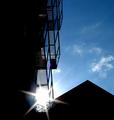
sunnyby GinaRothfelsComment by justine: CC......Hello Gina Rothfels
Fits The Challenge-Yes
Composition-Good
Background-Blue..very good
My Opinion-I looked at this shot a long time. I like looking at it.
I happen to read a short article about shooting into the sun. They listed several tricks, but mostly it was for macro. I'm attracted to this type of shot. It's 90° different from something I'd of seen to shoot. [A bonus of being a member of DPC]I love that your eye saw this and captured it. I also like the patterns in the grates. The sun flare is also nice. Good job.
|
| Photographer found comment helpful. |
| 04/19/2003 11:47:59 AM |
sunnyby GinaRothfelsComment by jmsetzler: I like the silhouetted architecture here... the sun flare is also excellent :) - setzler |
| Photographer found comment helpful. |
| 04/19/2003 09:43:40 AM |
Half Timeby GinaRothfelsComment by undieyatch: I love the quality of this picture. It refrains from a cold commercial or "product shot" feeling - which might be due to the antique clock, but I doubt it.... it is good work! It has outstanding composition. The colour seems accurate and is pleasing... the frame works with the image. |
| 04/17/2003 07:05:36 PM |
ruinby GinaRothfelsComment by GinaRothfels: I feel I must reply to comments that it is not horizontal. The house is actually on a curve, so it would be impossible to make the whole pavement line up. |
| 04/17/2003 02:03:43 PM |
|
| 04/17/2003 07:52:02 AM |
ruinby GinaRothfelsComment by Annida: Hello from the Critique Club!
Hi Gina
Well, my first impression of this picture is definitely colour. Everything is a tiny bit over saturated, so it all sticks out! The fact that it all sticks out kind of makes it all ... flat. There seems to be no horizon or depth in the photo. Kind of like a painting, which is a very cool effect, if you ask me. It seems like you took this around 12 noon or something, which made the lighting quite harsh and bright.
Something that could help a bit is if you make the picture straight. it seems the camera was tilted to the left a bit; unless the road was a bit tilted, it just doesn't look like it was intentional, which makes it look you didn't plan it that way.
I like the fact that this isn't the conventional type of "colour" photo for this challenge. Well done, good capture, and good luck in the following challenges.
-Annida |
| Photographer found comment helpful. |
Home -
Challenges -
Community -
League -
Photos -
Cameras -
Lenses -
Learn -
Help -
Terms of Use -
Privacy -
Top ^
DPChallenge, and website content and design, Copyright © 2001-2026 Challenging Technologies, LLC.
All digital photo copyrights belong to the photographers and may not be used without permission.
Current Server Time: 09/28/2026 03:27:59 PM EDT.