DPChallenge: A Digital Photography Contest You are not logged in. (log in or register
 
Browse Settings
Currently viewing:
MemberGinaRothfels

Show comments:

Per page:

Order:

Comments:


Comments Received by GinaRothfels
Pages:   ... [469] [470] [471] [472] [473] [474] [475] ... [538]
Showing 4711 - 4720 of ~5377
Image Comment
The Garden
05/28/2003 01:57:49 PM
The Garden
by GinaRothfels

Comment by Dustin:
good job. nice pic.
The Garden
05/28/2003 01:33:39 PM
The Garden
by GinaRothfels

Comment by kiwiness:
The red border is clashing with your image, this is one of those photos that probably would have been better without a border completely - 7.
Photographer found comment helpful.
The Garden
05/28/2003 12:23:06 PM
The Garden
by GinaRothfels

Comment by puppy52:
I love reflections! The red gives it a slightly eerie feel but it's kinda cool nevertheless :)
Photographer found comment helpful.
The Garden
05/28/2003 07:22:04 AM
The Garden
by GinaRothfels

Comment by gaja_tz:
it is oversaturated, overexposed upper sidee of the image, nice reflections ... =5
Photographer found comment helpful.
The Garden
05/28/2003 02:10:36 AM
The Garden
by GinaRothfels

Comment by shadow:
i like the colours. This is technically a nice looking photo except that on the right side of the image, the focus is out quite badly. The contrast of the sky is too high.
Photographer found comment helpful.
Green Living
05/27/2003 06:34:24 PM
Green Living
by GinaRothfels

Comment by HBunch:
*Critique Club*
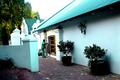
Secondary colors are created by mixing EQUAL amounts of 2 primary colors. By this definition, the only color that is close to meeting the challenge is the green tree in the background. The rest appears to be more of a blue/green, which would not be a secondary color.
(darn those picky people)
I am also not diggin the left tilt of the photo. It's not enough to be dramatic, but enough to be noticed, which makes it look like an error rather than something that was done for a reason.
The focus and clarity are also strange. I'm not really sure what's going on with that green tree in the background. It looks really pixeled, when the rest of the shot is, for the most part, ok.
It is hard to tell if the white area is sky, or if it maybe another wall from a building in the back?? I do think it is sky though, and I do also think that it's way too bright. See what it's doing to the roof?
I think it's a pretty scene, worth trying again for outside the challenge. I like the pillars, and the round ball on the top of the building. I think it makes for a nice composition.
Try it on a day that is not quite so blinding though.
~Heather~
Photographer found comment helpful.
matrix
05/27/2003 02:06:28 PM
matrix
by GinaRothfels

Comment by MattW:
nice job..you did a good job making the picture look like the matrix
Photographer found comment helpful.
matrix
05/21/2003 01:40:28 PM
matrix
by GinaRothfels

Comment by Allen:
nice use of light and nice idea good job
Photographer found comment helpful.
matrix
05/21/2003 10:10:31 AM
matrix
by GinaRothfels

Comment by 'Pong:
the flare makes this photo very interesting but I'm not sure about his action. IMO, the confusion of the composition could go well with the challenge but the the subject doesn't tell that.
Photographer found comment helpful.
matrix
05/21/2003 12:31:35 AM
matrix
by GinaRothfels

Comment by carolee:
I think the color works more in this photo than the subject -- hard to tell what I'm seeing here. Blur and graininess are ok because of the theme, I think. I like the balance between light and dark.
Photographer found comment helpful.
Pages:   ... [469] [470] [471] [472] [473] [474] [475] ... [538]
Showing 4711 - 4720 of ~5377


Home - Challenges - Community - League - Photos - Cameras - Lenses - Learn - Help - Terms of Use - Privacy - Top ^
DPChallenge, and website content and design, Copyright © 2001-2025 Challenging Technologies, LLC.
All digital photo copyrights belong to the photographers and may not be used without permission.
Current Server Time: 12/02/2025 10:49:24 PM EST.