| Image |
Comment |
| 09/16/2002 05:15:00 PM |
|
| 09/16/2002 12:47:00 PM |
|
| 09/16/2002 12:32:00 PM |
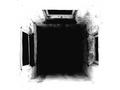
Shaftby millerComment by LindaLee: This gives me a weird feel of kind of a neg spc within a neg spc. I find the shot interesting, but it doesn't engage my interest a great deal. lhall-6 |
 Photographer found comment helpful. Photographer found comment helpful. |
| 09/16/2002 11:33:00 AM |
Shaftby millerComment by labrynthe: Interesting choice of subject and a well composed picture. I like how the negative spaces surround the subject. Good use of contrast to accentuate the mood of the picture. Makes me feel like I'm entering 5 portals. - labrynthe |
| Photographer found comment helpful. |
| 09/16/2002 10:21:00 AM |
Shaftby millerComment by justine: Zzzooom wonderful perspective and meets the challenge well. Good work the b&w really adds to this shot. I have to type quickly as I feel like I'm falling!!!! >g< Score 7 Justine |
| Photographer found comment helpful. |
| 09/16/2002 08:58:00 AM |
|
| 09/16/2002 08:17:00 AM |
Shaftby millerComment by Shiiizzzam: Wonderful ! I love this and can't wait to see how you did it !!!!!!! =10 Shiiizzzam |
| Photographer found comment helpful. |
| 09/16/2002 02:27:00 AM |
Shaftby millerComment by razwan: Now this an excellent photo because it has atmosphere and it evokes curiosity... 'Where is this place? What does the darkness lead to? etc.' I like the contrast between the over exposed whiteness of the walls and the darkness. Also, good use of neg. space. Excellent work! |
| Photographer found comment helpful. |
| 09/16/2002 01:03:00 AM |
Shaftby millerComment by indigo997: REALLY great work. It's so artsy fartsy. Looks like gallery material to me. Can I have a print with a black mat pleeeease? 9 ~indigo997 |
| Photographer found comment helpful. |
| 08/26/2002 09:01:00 AM |
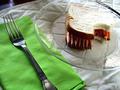
Lunchby millerComment by miller: Thank you everyone for your great comments. Yes, I know about the highlights on the right side of the sandwich, but there wasn't much I could do about it and get the light the way I wanted it (well, at least not with my setup). I used a white board to try to get some more light on the pencils, but as you can see it didn't work so well. The shadow is there on purpose, to make the sandwich stand out more, but I can see why some people don't like it. |
Home -
Challenges -
Community -
League -
Photos -
Cameras -
Lenses -
Learn -
Help -
Terms of Use -
Privacy -
Top ^
DPChallenge, and website content and design, Copyright © 2001-2026 Challenging Technologies, LLC.
All digital photo copyrights belong to the photographers and may not be used without permission.
Current Server Time: 06/09/2026 01:25:26 PM EDT.