|
|
|
Showing 191 - 200 of ~239 |
| Image |
Comment |
| 06/30/2004 12:26:36 AM | Cowboys and their ????? horses????????by GalimagesComment by Kolya: This would have been a great "Newspaper" photo - Horses Shrink! But works well for extraordinary as well! I think color would have worked better here - looks like the horses are blending into the background a bit. |
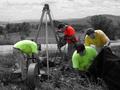
| 06/25/2004 02:23:54 AM | Men At Workby GalimagesComment by Glacierwolf: You know how much I like this picture.......... it might look fine because you know the people in the picture and what the original looked like. Probably the first time you've seen these guys actually working. But to a viewer it lacks a subject to focus on - one guy bending over a hole, one guy working on machinery, two guys stuffing a black something that is cropped out. If they had at least turned to face the camera and waved while you said, "Cheese!" it would have been kinda cool in a campy way. What might have worked on this picture - leave the background and desaturated the workers - would have made a statement about how people view manual laborers as not there...... and a better picture as well. |
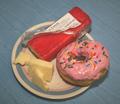
| 06/25/2004 01:08:39 AM | To Carb or Not To Carb? - that is the question.by GalimagesComment by Neuferland: Okay, you have donuts like this in your apartment or were they at work? If they are in your apartment I can help you with that dilemma, just hand them over and no one will get hurt! ;)
As for the shot, some tough comments, I honestly gave this a 4 during the challenge. And for most of the same reasons stated, dull background, slightly out of focus and rather uninteresting composition. This could be done and with a few changes be a much stronger contender.
First the background, go to white or black on shots like this. Give the camera a starting point for the white balance. Some people use posterboard but I prefer cloth, less glare if you have the right material. Second, the plate, the blue rim around the side is a bit distracting, again, a solid color plate, probably white or even a serving platter of some sort to give it an air of elegance.
The lighting seems a bit harsh, I'm thinking you used the flash or had harsh overhead lighting, a more diffused light with the camera on a tripod coming more from the front would have made a big difference in this shot. The set up the shot isn't bad at all, just the surrounding elements. Oh, do get rid of the wrapper with writing if you use cheese in another shot, it detracts and takes the focus away from the food and of course, get a chocolate donut! :)
Deannda |
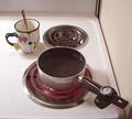
| 06/22/2004 10:06:16 PM | As the saying goes, "a watched pot will never boil."by GalimagesComment by graphicfunk: From the Critique Club:
This is a clever diagonal composition. You have cup with spoon at upper corner, the pot and its handle. You threw the extra weight on the pot handle with the watch and so the eye travels up and down on the diagonal. Notice how the spoon reinforces the top and note how it blends in with the green line of the cup. I am sorry if I overreach to recompose, but I would have rotated the spoon handle opposite the cup handle. This would give me a T compostion to break the straight diagonal line and bringing the other burner into play. Another flight of fancy would be to move the cup a little to the left and place the spoon with the handle just over the lonely unused burner. The bulb on the spoon would have filled just a bit more of real estate.
The watch is well placed. It keeps the eye from slipping off the bottom right. Pictures like these depend on delicate placement, because you are composing an image. It often helps to squint your eyes as you compose because it helps to find the universally accepted modes of design. Nothing is really new. It is mostly old wines in new bottles.
I think you did nicely here because many decisions must be made to make a simple composition and sometimes, the simpler it is, the harder to execute. By the way, creating these types of scenes will certainly sharpen your design and compositional sense. Good work. dan Message edited by author 2004-06-22 22:20:03. |  Photographer found comment helpful. Photographer found comment helpful. |
| 06/22/2004 07:10:51 PM | |
| 06/22/2004 03:36:51 PM | Men At Workby GalimagesComment by geewhy: Another shot that you probably wouldn`t give much thought to if it was in full colour..but it takes on so much more interest in the way you have handled it.
Good work |
| 06/21/2004 01:45:25 PM | Men At Workby GalimagesComment by e301: Reminds me of Kiwi's composite shots - I think it's the de-sat that's doing that, and the fact that all the guys seem to be the same build. Also have the slightly bizarre impression that the cable being fed in by one set of blokes is what the other two are looking for. |
| 06/21/2004 12:21:11 AM | |
| 06/19/2004 11:09:07 AM | |
| 06/19/2004 06:23:42 AM | |
|
Showing 191 - 200 of ~239 |
Home -
Challenges -
Community -
League -
Photos -
Cameras -
Lenses -
Learn -
Help -
Terms of Use -
Privacy -
Top ^
DPChallenge, and website content and design, Copyright © 2001-2026 Challenging Technologies, LLC.
All digital photo copyrights belong to the photographers and may not be used without permission.
Current Server Time: 07/16/2026 10:47:09 AM EDT.
|