Comfortable Silenceby
rll07Comment by ursula: FROM THE CRITIQUE CLUB
Hello Randy,
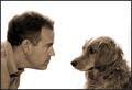
I am glad this picture ended up with a good score, because it is a very good shot. My main "complaint" is the title, "Comfortable Silence". Somehow, the silence does not look comfortable exactly, more "wary" (on the dog's side) or even just a bit confrontational. It looks to me like the man is winning the staredown.
The white background is striking (btw, how did you get it so white?). The edges (hairs) around the top of both heads look slightly "lost" (I think "blown out" is the term that's used for this). Focus is good, could be slightly sharper, but it's good. Sepia is a good choice IMO. Simple border is perfect.
The more I sit here and look at this picture, the more I think, "I like it, but there's something that's bothering me about it, and it's NOT the title." One thing that strikes me is that the shape of the dog comes from below (from the bottom up), whereas the man comes from the side (from the left). Makes the man look somewhat aggressive (IMHO) compared to the dog. Also, the large amount of white space attracts a lot of attention that possibly should be spent on the figures instead.
I don't think I have any good advise on how to make a good shot like this better, sorry. It's a good shot. It causes a pretty strong reaction in the viewer, which is very good. I guess I'll stop here.
Congratulations on an excellent finish! BTW, I love your shot of the mountains and the moon! It looks like a painting almost.
Take care,
Ursula (uabresch)
Complaints, comments, questions ... feel free to contact me.