| Image |
Comment |
| 05/28/2004 08:05:31 PM |
|
| 05/28/2004 04:21:52 PM |
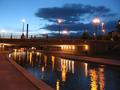
Reflectionsby anatomComment by sailracer_98: Interesting shot. I like the light reflections. The shot is a bit on the small side- I can't make out as much detail in the picture as I would like. The focus also looks a little soft on the bridge, or maybe there was some slight camera movement during the exposure. |
 Photographer found comment helpful. Photographer found comment helpful. |
| 05/27/2004 08:26:37 AM |
Reflectionsby anatomComment by byronb: Is this the canal in Indy? It seems a little soft in focus, but it's a good idea. How about getting a little human interest with a silhouette of a couple people walking into the frame on the top right. With a tripod and a slower exposure time you could have really saturated the colors more. |
| Photographer found comment helpful. |
| 05/26/2004 10:43:50 PM |
Reflectionsby anatomComment by traser: kinda blurry and not level(the horizon) Use a tripod and try composing these with the rule of 3rds. |
| Photographer found comment helpful. |
| 05/26/2004 07:24:59 PM |
|
| Photographer found comment helpful. |
| 05/26/2004 06:32:52 PM |
Reflectionsby anatomComment by omnibus: I think this photo could be helped by cropping to follow the rule of thirds. Although the clouds offer some interest, the main draw in this photo (IMHO) is the light and the play of it on the river. Try cropping so that the bridge is 1/3 of the way down from the top. You have nice reflections and a great line made by the river. |
| Photographer found comment helpful. |
| 05/26/2004 06:18:19 PM |
|
| 05/26/2004 06:03:01 AM |
Reflectionsby anatomComment by e301: Why so many small photos this week? maybe it's just a freak of the order I'm seeing them in. If it should be a software problem - there are many free editors, many programs put out on the coverdiscs of computer and photography magazines ... you don't have to spend $600 on photoshop. If someone were to enter a 4x6 print into a print photography competition, would you expect it to get marked down?
This doesn't seem particularly sharp, even at this resolution. Compositionally, you've placed the bridge right across the centre of frame, at the expense of some of those reflections, and at the expense of a comfortable shape for the eye to follow through the frame: placed a little higher, it would, in conjunction with the river, create a curving sweep up and round to the right that would give a strong central graphic element to the image, and improve it for the viewer no end. 3 |
| Photographer found comment helpful. |
Home -
Challenges -
Community -
League -
Photos -
Cameras -
Lenses -
Learn -
Help -
Terms of Use -
Privacy -
Top ^
DPChallenge, and website content and design, Copyright © 2001-2026 Challenging Technologies, LLC.
All digital photo copyrights belong to the photographers and may not be used without permission.
Current Server Time: 07/15/2026 05:38:57 PM EDT.