| Image |
Comment |
| 06/15/2003 03:27:05 PM |
|
 Photographer found comment helpful. Photographer found comment helpful. |
| 06/13/2003 09:45:05 AM |
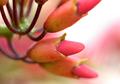
natureby sanandanComment by chelseayankie: The colors and composition of this photo are great!!! I would like to have seen the bottom two buds a little more focused. |
| Photographer found comment helpful. |
| 06/13/2003 08:05:53 AM |
natureby sanandanComment by amandolin: Okay photo in general, but not the best magazine cover.
Nice colors.
Too blurry. |
| Photographer found comment helpful. |
| 06/12/2003 12:49:00 AM |
natureby sanandanComment by goodtempo: i don't know of any magazines with this landscape shape, although i haven't seen them all. i would have preferred portrait orientation. nice image. |
| Photographer found comment helpful. |
| 06/11/2003 09:48:43 PM |
natureby sanandanComment by alanfreed: I like the depth of field attempted here, but there needs to be at least some significant portion that is in focus. |
| Photographer found comment helpful. |
| 06/11/2003 01:58:56 AM |
natureby sanandanComment by RiderGal: Personally I do not consider magazines to be in a horizontal shape... thats just me though. I would have used slightly more DOF, although I like the nonexistant background, I think the picture would have looked a tad bit sharper with just a little more DOF... The main part of the picture looks very centered... I think I might have cut out some of the right side of the photo, to make it a better picture. |
| Photographer found comment helpful. |
| 06/10/2003 12:41:31 AM |
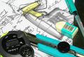
myworkspaceby sanandanComment by ChrisW123: I love this shot. This is REALLY tickling my brain for some reason! Must be the colors and abstract writting, not sure. Love it! 9. |
| Photographer found comment helpful. |
| 06/09/2003 10:07:49 PM |
myworkspaceby sanandanComment by orussell: Too much happening here. Your eye is not drawn to any particular subject. Very chaotic. Maybe that was your intent. Aside from that the levels/colour/saturation or something is out of whack. I'm commenting on something I know little about. 5 |
| Photographer found comment helpful. |
| 06/09/2003 12:04:17 PM |
myworkspaceby sanandanComment by Mitonski: I said this about another entry, it seems a bit too cluttered to me. Nice colours, good lighting, just a bit too much stuff in there. Good luck with it. |
| Photographer found comment helpful. |
| 06/09/2003 12:57:23 AM |
|
| Photographer found comment helpful. |
Home -
Challenges -
Community -
League -
Photos -
Cameras -
Lenses -
Learn -
Help -
Terms of Use -
Privacy -
Top ^
DPChallenge, and website content and design, Copyright © 2001-2026 Challenging Technologies, LLC.
All digital photo copyrights belong to the photographers and may not be used without permission.
Current Server Time: 07/17/2026 05:02:53 AM EDT.