| Image |
Comment |
| 08/20/2005 08:35:10 AM |
Palm%.jpgby stormyComment by dahkota: TAG! Simple but effective. Very well done. Tones and hues are excellent. |
 Photographer found comment helpful. Photographer found comment helpful. |
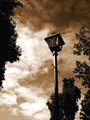
| 08/20/2005 08:34:21 AM |
Lamp Postby stormyComment by dahkota: Tag! Like this image. Like the way the trees restrain it on the edges. Love the tones used. Great timing for the perfect sky for this image. Composition great. Really conveys a mood. |
| Photographer found comment helpful. |
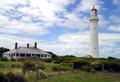
| 08/20/2005 08:32:25 AM |
Home and Houseby stormyComment by dahkota: Tag! A very pretty image. Like the lighting and the saturation levels on this one. The house seems to be falling towards me - not sure if thats lens abberation or the house just looks that way. I see the lighthouse is straight so I know its not that. Well composed. |
| Photographer found comment helpful. |
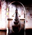
| 08/20/2005 08:25:12 AM |
Tunnelby stormyComment by dahkota: TAG! Wow! I like this much better than your other one. This one conveys an emotion about the subject where the other just seems to be a picture. This also has a lot of depth. Excellent job! |
| Photographer found comment helpful. |
| 08/20/2005 08:22:52 AM |
Windowby stormyComment by dahkota: Tag! This is really cool. I would argue that the orange lights should glow a little more to really trap the viewer's eye. I think the composition is well done. And the focus and DOF are dead on - not easy with a subject such as this to get your camera to focus. The filigree at the bottom seems to have an evil grin. :) |
| Photographer found comment helpful. |
| 08/20/2005 08:19:09 AM |
|
| Photographer found comment helpful. |
| 08/20/2005 08:16:47 AM |
The Afternoonby stormyComment by dahkota: Tag! I think the color and composition work very well in this image. Your timing is great for the best lighting. Like the texture in the (crap, what do they call them?) stamens and think it empasizes your short DOF which works well in this image. |
| Photographer found comment helpful. |
| 08/20/2005 08:14:46 AM |
1869by stormyComment by dahkota: Tag! There are things I really like about this image and things I don't. I like the composition, I like the textures, I like the tones. I love the two windows in the door and the way they kind of fade into the brown at the edges. I don't like the white spot at the lower right or the white bar at the upper right - they compete with the windows above the door for my attention and I would love to see them gone. I'm not sure what your processing technique was but I get the feeling that this was softened and then sharpened. While the door and the left side look really good, the blue wall seems to have sharpening artifacts or something. Maybe if the magenta was desated I wouldn't see that. A well seen image! |
| Photographer found comment helpful. |
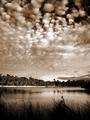
| 08/20/2005 08:07:20 AM |
Newport Lakes 2by stormyComment by dahkota: Tag! This is beautiful. I love the tones in which you've rendered it. I think the composition works very well. Only nitpicky thing I can find is the distracting blade of grass that goes through the water and to the other shore. It cuts the fluidity of the water and looks like a line that is supposed to lead me somewhere. The lighting is good. The fluffiness of the clouds plays against the lines in the shore and the grass. Very well seen. |
| Photographer found comment helpful. |
| 08/12/2005 02:46:26 PM |
|
| Photographer found comment helpful. |
Home -
Challenges -
Community -
League -
Photos -
Cameras -
Lenses -
Learn -
Help -
Terms of Use -
Privacy -
Top ^
DPChallenge, and website content and design, Copyright © 2001-2026 Challenging Technologies, LLC.
All digital photo copyrights belong to the photographers and may not be used without permission.
Current Server Time: 07/16/2026 04:32:51 PM EDT.