| Image |
Comment |
| 11/21/2005 12:40:49 PM |
|
 Photographer found comment helpful. Photographer found comment helpful. |
| 11/21/2005 09:36:18 AM |
|
| Photographer found comment helpful. |
| 11/21/2005 01:39:07 AM |
|
| Photographer found comment helpful. |
| 11/19/2005 10:04:12 PM |
|
| Photographer found comment helpful. |
| 11/19/2005 02:36:36 PM |
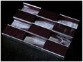
The Impostorby adamwebComment by sestevens: That's a pretty good idea. My opinion about the DOF is because of the fine nature of the camoflauged objects, the entire composition in this 'aerial' should be sharp. However, I could easily see such a depth of field if the photo had a more dramatic perspective. Also love the composition of the actual objects themselves. |
| Photographer found comment helpful. |
| 11/18/2005 03:05:22 PM |
|
| Photographer found comment helpful. |
| 11/17/2005 01:32:25 PM |
The Impostorby adamwebComment by Jammur: Clever idea and a good photo, however the paper clip is merely hiding in the staples, not trying to look like one. |
| Photographer found comment helpful. |
| 11/16/2005 09:58:18 PM |
The Impostorby adamwebComment by jayjay06: I like the set-up although the top middle staple set is a bit dark and lost into the background. I would have liked a bit more DOF too. Overall great shot and great twist on the camo. |
| Photographer found comment helpful. |
| 11/16/2005 08:41:10 PM |
The Impostorby adamwebComment by Neuferland: Hahaha, had to look at this for a second to figure out what you were doing here. Very clever, unique and well doen. I like the set up, the shapes, the overall composition. Only two things bother me, the way they are lined up aka, the angle, for some reason I think it would be better going lower left to upper right, at least more I don't know, natural for some reason but this works well also. The other thing is the upper middle staples, they lose a lot of definition, I know you are working with as shallow DOF but it seems that at least part of it should still be visible as far a lines and such. But again, great idea, An 8 |
| Photographer found comment helpful. |
| 11/16/2005 12:43:55 PM |
Library in Autumnby adamwebComment by LeeD: The focus seems a little off and the highlights are a bit blown out. Honestly I don't think this image lends itself very well to a triptych. There is no natural separation where you have chosen to break the image and the gray/brown background doesn't help either. |
| Photographer found comment helpful. |
Home -
Challenges -
Community -
League -
Photos -
Cameras -
Lenses -
Learn -
Help -
Terms of Use -
Privacy -
Top ^
DPChallenge, and website content and design, Copyright © 2001-2026 Challenging Technologies, LLC.
All digital photo copyrights belong to the photographers and may not be used without permission.
Current Server Time: 07/16/2026 01:55:03 AM EDT.