| Image |
Comment |
| 02/16/2003 10:45:34 AM |
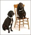
Bahsworth & Brodamireby GotchaComment by inspzil: Greetings fromt the Critique Club
by Inspzil
Composition - I really liked this shot during voting. The dogs look great. They have a great expression on their face and they're looking the right way and everything. Their positions in the frame are great and I do like the chair there. It NEEDS to be there. I had one small complaint earlier and I'm still sticking to it - I don't like the way they are sinking into the floor. Aside from that, I wouldn't change a thing.
Technical - Very well taken photo. Exposure is a little tricky here with the dark dogs and white background but I think you nailed it. They are wonderfully focused and framed. Awesome. Processing is very good too. The wrinkles are one of those necessary evils in the amateur photography game. Busy backgrounds will kill you every time though on DPC. Its good you didn't blow out anything. It's really very good.
Overall - Loved the shot then, still love it. I have a dog about this color and a rottweiler too. I'm feeling inspired to pose them similarly and see if I can do something like this. Great pic gotcha. I thought you deserved to place better, but I know I would be very pleased to finish even close to where you did. Keep up the good work and thanks for sharing this gem with us on DPC. - Bob |
 Photographer found comment helpful. Photographer found comment helpful. |
| 02/15/2003 09:49:27 AM |
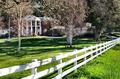
The Greener Side of the Fenceby GotchaComment by lisae: A busy photo. All the trees distract from the fence, and the light is very bright. Perhaps if you had focussed more on the fence and not tried to frame the house in as well, you would have created a photo with more impact. |
| Photographer found comment helpful. |
| 02/12/2003 10:24:26 PM |
The Greener Side of the Fenceby GotchaComment by ChrisW123: Whew, that's nice! Is the property for sale?!! :) Not that I could afford it. You maybe should have stepped a little closer to the fence and angled the camera to the right to get more perspective on the fence. Great shot tho! 8. |
| Photographer found comment helpful. |
| 02/11/2003 09:37:17 PM |
The Greener Side of the Fenceby GotchaComment by W.R.Miller: Very nice. I love photos of beautiful architecture. The fence tends to lead my eye off the edge and out of the photo though. Even though, I really like the photo.
Bill (wackybill) |
| Photographer found comment helpful. |
| 02/10/2003 10:33:40 PM |
|
| Photographer found comment helpful. |
| 02/10/2003 06:11:52 PM |
The Greener Side of the Fenceby GotchaComment by Jacko: Nice vibrant colours in the grass. I like the placement of the mansion, but the trees are obstructing too much of the view. Love the way the fence seems to converge in the distance. Jacko. |
| Photographer found comment helpful. |
| 02/10/2003 12:06:55 AM |
|
| Photographer found comment helpful. |
| 02/09/2003 06:56:31 PM |
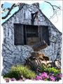
Cottageby GotchaComment by psychephylax: A visit from the critique club :)
I think this image was good, but you actually took away from it with the photoshop work. The foreground is a bit busy but I like the old wagon/cart thing leaning against the wall. The foreground flowers I could care less about. They don't add much to the image.
The white uneven photo does not help the photo, I think you should have made it a solid white black border or something dark single colored so that the white house and the sky stand out.
I think this would work really well with B&W or Sepia tone perhaps some dust and some other photoshop work to make it look "old" and it would be much better.
It definitely meets the challenge, composition is good (aside from the forground flowers), focus is great and exposure is dead on. Good try but could be a bit better. |
| 02/09/2003 05:54:11 PM |
|
| Photographer found comment helpful. |
| 02/08/2003 12:01:23 AM |
|
| Photographer found comment helpful. |
Home -
Challenges -
Community -
League -
Photos -
Cameras -
Lenses -
Learn -
Help -
Terms of Use -
Privacy -
Top ^
DPChallenge, and website content and design, Copyright © 2001-2026 Challenging Technologies, LLC.
All digital photo copyrights belong to the photographers and may not be used without permission.
Current Server Time: 07/16/2026 02:37:03 AM EDT.