| Image |
Comment |
| 05/30/2004 12:21:17 PM |
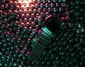
Hit from all sidesby MAKComment by melismatica: The placement of the watch against this background makes for a confusing composition. It's a rather noisy image and there are quite a few hotspots (the edge of the watch face and the top edge of the frame). The bead thing is rather interesting as an abstract and I encourage you to work on the lighting some more and see what you come up with. |
 Photographer found comment helpful. Photographer found comment helpful. |
| 05/29/2004 12:45:24 AM |
Hit from all sidesby MAKComment by Jesuispeure: It's got some strange color splotches going on, most noticably on the face of the watch. This is one that may have benefitted from Neat Image. Otherwise, it's got a nice composition and I like the choice of colors. |
| Photographer found comment helpful. |
| 05/26/2004 09:42:14 PM |
|
| Photographer found comment helpful. |
| 05/26/2004 12:04:05 PM |
Hit from all sidesby MAKComment by Zal: You need to have the watch lit up too! As it is now, why is the watch even in the frame? |
| Photographer found comment helpful. |
| 05/26/2004 09:08:35 AM |
Hit from all sidesby MAKComment by wkoffel: This is rather dark and indistinct, even on my bright mac monitor. And the bottom edge of the (watch?) face seems to have a lot of cmopression artifacts along the hilites, maybe a photoshop issue? |
| Photographer found comment helpful. |
| 05/21/2004 11:44:35 AM |
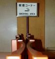
The Dying Habbitby MAKComment by melismatica: Visually cluttered (that vent in the lower right corner, the door breaking up the background, the blurry foreground. Nothing particularly interesting about this scene. It shows a habit but not in a new or interesting way. |
| Photographer found comment helpful. |
| 05/21/2004 08:30:48 AM |
The Dying Habbitby MAKComment by cghubbell: Good selection of point of view. More depth of field is required to make this angle work though; The blurred foreground is a distraction. Would also be nice if the chairs were aligned to create a repeating pattern. |
| Photographer found comment helpful. |
| 05/20/2004 09:01:11 PM |
|
| Photographer found comment helpful. |
| 05/19/2004 06:14:12 PM |
The Dying Habbitby MAKComment by ronlcox: In any language, right. Like the way, whatever they are, leads your eye to the sign and your use of DOF. Lighting could be better. |
| Photographer found comment helpful. |
| 05/19/2004 04:53:07 PM |
The Dying Habbitby MAKComment by Falc: I know what you are trying to convey, but the image lacks punch. the dof is lacking, the out of focus chairs need cropping out. The lighting is awful and needs some external light source. |
| Photographer found comment helpful. |
Home -
Challenges -
Community -
League -
Photos -
Cameras -
Lenses -
Learn -
Help -
Terms of Use -
Privacy -
Top ^
DPChallenge, and website content and design, Copyright © 2001-2026 Challenging Technologies, LLC.
All digital photo copyrights belong to the photographers and may not be used without permission.
Current Server Time: 04/30/2026 08:14:48 AM EDT.