| Image |
Comment |
| 01/24/2003 09:27:27 PM |
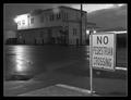
No Pedestrian Crossingby bdshortComment by irae: Very nice tones, and a good, desolate feeling. Plenty of depth for that walk-into-the-picture feeling (especially tasty irony w/r/t the sign). The top feels a little too tight to me, and the white border aggravates the problem. |
| 01/23/2003 09:59:35 PM |
No Pedestrian Crossingby bdshortComment by Lustre: Nice work - I like the feel to this photo. You were lucky to get a wet road to photograph. The sign grabs my attention since it is well lit in the photo. The border is appropriate and frames the photo well without distracting me. Great work. |
| 01/23/2003 09:35:35 PM |
No Pedestrian Crossingby bdshortComment by PTLParsons: Pleasantly surprised at the quality of this night shot. Very clear and sharp. Love the sky. The sign on the other side of the street says it is a pedestrian crossing. Wonder which sign is correct? Would love to see a daytime photo of this place. Well done and really deserves a 9. |
| 01/23/2003 05:17:57 PM |
No Pedestrian Crossingby bdshortComment by Bullwinkle: The lighting is very pleasing in this image. I especially admire the wet look on the pavement and the various textures. The highlight on the pavement is beautiful. Personally I would like to separate the sign from the lights and building corner in the background. A matter of breathing space.The hint of bright sky adds an uplifting note to a sombre picture. The sign does stand out well from the background which is another nice contrast. A worthy notable image. |
| 01/22/2003 10:53:42 PM |
No Pedestrian Crossingby bdshortComment by Wheeler1992: nothing less than a ten. by far the best photo that I have seen. the sign is a small portion of the whole package which is perfect. Did I mention that this is a 10 and the best photo that I have seen so far |
| 01/22/2003 09:16:50 PM |
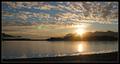
Alaskan Landscape by bdshortComment by magnetic9999: Critique Club Review
Greetings.
It is very difficult to say anything critical about this shot.
About the only thing I *might* have done different was put in a little less of that land in the foreground. Maybe done away with it all together, or if possible moved up to the its edge. This might have moved your horizon to the lower third, which is a good place for horizons :)
You've done a great job with composition .. the mountain, the sunset, the additional mountains. the sky, the clouds. you waited till the right time of day to get this shot.
congrats on a well deserved ribbon! |
| 01/22/2003 07:33:08 PM |
|
| 01/22/2003 02:57:12 PM |
|
| 01/22/2003 01:08:30 PM |
|
| 01/22/2003 02:00:00 AM |
|
Home -
Challenges -
Community -
League -
Photos -
Cameras -
Lenses -
Learn -
Help -
Terms of Use -
Privacy -
Top ^
DPChallenge, and website content and design, Copyright © 2001-2026 Challenging Technologies, LLC.
All digital photo copyrights belong to the photographers and may not be used without permission.
Current Server Time: 06/14/2026 03:34:25 PM EDT.