| Image |
Comment |
| 08/01/2002 03:18:00 PM |
|
| 07/31/2002 05:12:00 PM |
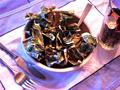
Money Hungryby Ricky CleaveComment by Gracious: Your picture has impact! "BAM" as Emeril might say. The coloring is sort of surreal, and is very fitting. Something so basic as eating, is so familiar to all. So right off you identify with your audience. VERY GOOD! Then as my eye wanders over the scene I am impacted with UGH! Eating money....yuck! So the photo effectively provoked disdain. VERY GOOD! Brilliant photo. A little bitty thang that is distracting is the crease in the fabric but at least it's on a nice diagonal... :-) Oh and technically...yeah...looks fine to me. 10 Gracious |
| 07/31/2002 04:47:00 PM |
|
| 07/31/2002 01:37:00 PM |
Money Hungryby Ricky CleaveComment by Swashbuckler: This is a really good idea! I especially like the coin drink! First, it does appear on the dark side on my monitor. Next, I question your photo angle and cropping. I would suggest taking this from the view of the eater. Next, I would suggest not cropping the basic elements out of the shot. (I'm so square, I like seeing the whole picture) Lastly, the red glow? Is that from a filter? Kinda surreal, if that was what you were going for....Good job! 8 Swash |
| 07/31/2002 11:43:00 AM |
|
| 07/31/2002 09:24:00 AM |
Money Hungryby Ricky CleaveComment by jsabbarton: Witty idea, original and to the point… Although, I'm not sure I like the lighting effects or understand their meaning. The lighting (in my opinion) has generated overkill on a image that could easily stand on its own without it. |
| 07/31/2002 06:42:00 AM |
|
| 07/31/2002 01:00:00 AM |
|
| 07/30/2002 08:42:00 PM |
|
| 07/30/2002 04:26:00 PM |
Money Hungryby Ricky CleaveComment by sylk: Great idea. The only thing that distracts me is the use of purple. I"m not sure how that fits in. I'd also either get rid of the glass or fill it with something that relates to the metaphor. Composition and light is good though. |
Home -
Challenges -
Community -
League -
Photos -
Cameras -
Lenses -
Learn -
Help -
Terms of Use -
Privacy -
Top ^
DPChallenge, and website content and design, Copyright © 2001-2026 Challenging Technologies, LLC.
All digital photo copyrights belong to the photographers and may not be used without permission.
Current Server Time: 07/16/2026 09:26:56 PM EDT.