| Image |
Comment |
| 01/24/2003 09:36:47 PM |
|
| 01/23/2003 10:56:45 PM |
|
| 01/23/2003 02:55:41 PM |
|
| 01/23/2003 01:41:14 AM |
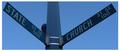
Ironic Intersectionby Ricky CleaveComment by dodobird: Very cool find, I just love the title. Your focus is good, but color wise, there is just too much blue in this shot. Where is the green of the signs? The color contrast of blue/green or even white/green would also help the signs stand out a bit more. I also might have tried to approach this shot at a different angle if at all possible. Due to the fact of having to read both signs I would have tried to get the post dead center in the shot, or if you cropped some include a bit more sky on the state side, give the shot a sense of balance. 7. |
| 01/22/2003 09:51:16 PM |
|
| 01/22/2003 02:33:02 PM |
|
| 01/22/2003 01:41:33 PM |
|
| 01/21/2003 11:58:39 PM |
|
| 01/21/2003 01:11:47 PM |
|
| 01/20/2003 10:40:32 PM |
Ironic Intersectionby Ricky CleaveComment by Lustre: Nice composition. I'm curious as to why you chose such a bright border around a fairly dark image. The focus is very crisp, which makes the writing easy to read and the balance of the signs is good. |
Home -
Challenges -
Community -
League -
Photos -
Cameras -
Lenses -
Learn -
Help -
Terms of Use -
Privacy -
Top ^
DPChallenge, and website content and design, Copyright © 2001-2026 Challenging Technologies, LLC.
All digital photo copyrights belong to the photographers and may not be used without permission.
Current Server Time: 07/16/2026 03:09:31 PM EDT.