| Image |
Comment |
| 05/17/2005 11:53:59 PM |
Twistedby artvetComment by dbenson: Makes me want to go on a cattle drive. Very nice shot. I'm looking forward to seeing your settings for this shot. |
 Photographer found comment helpful. Photographer found comment helpful. |
| 05/17/2005 07:04:06 PM |
|
| Photographer found comment helpful. |
| 05/17/2005 04:14:33 PM |
Twistedby artvetComment by docurrie: I think you need a little bit larger subject to block more of the sun |
| Photographer found comment helpful. |
| 05/17/2005 08:11:58 AM |
Twistedby artvetComment by ClickNSee: Very nice composition. One of the few images where "just a little detail" is not needed. this is totally self expanitory. Interesting color in the sky; I can't wait to see some of the details about this image. <6> |
| Photographer found comment helpful. |
| 05/16/2005 08:57:33 AM |
|
| Photographer found comment helpful. |
| 05/16/2005 07:06:09 AM |
|
| Photographer found comment helpful. |
| 05/16/2005 02:32:24 AM |
|
| Photographer found comment helpful. |
| 05/16/2005 02:02:12 AM |
|
| Photographer found comment helpful. |
| 05/10/2005 01:44:33 PM |
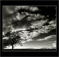
Solitary Treeby artvetComment by HBunch: *Critique Club*
I'm not sure what I can add that the 59 comments here already have not said.
This is a beautiful image. I am not so sure that it is minimalistic though. The whole frame is filled with interesting things to look at. The sky, the tree, the fence, and even the silhouetted ground. All of it combines together to make a reall nice image, but just not 'simple' enough for minimalism.
I love the silhouettes. They look really nice against that background. One thing that my eyes keep going back to is the light area in the lower left of the photo. I'm not sure exactly why, but that section bugs me a bit. I think it just seems like an odd place to be bright. It's drawing my attention to the bottom of the tree and that just seems like an odd place to want to draw attention too.
Focus and clarity look to be really good. Nothing is terribly blurry or soft.
Overall the image is very nice. Border is kind of huge, but doesn't distract from the image in my opinion cause it's black and white.
~Heather~ |
| Photographer found comment helpful. |
| 05/08/2005 06:14:41 PM |
|
| Photographer found comment helpful. |
Home -
Challenges -
Community -
League -
Photos -
Cameras -
Lenses -
Learn -
Help -
Terms of Use -
Privacy -
Top ^
DPChallenge, and website content and design, Copyright © 2001-2026 Challenging Technologies, LLC.
All digital photo copyrights belong to the photographers and may not be used without permission.
Current Server Time: 06/25/2026 07:08:48 AM EDT.