|
|
| Image |
Comment |
| 09/16/2002 09:59:00 AM | U.F.O.by GuillermoComment by jmsetzler: I see your intention here for negative space. I can't really say that the image inspires me much though. - jmsetzler |
| 09/16/2002 06:35:00 AM | U.F.O.by GuillermoComment by sulamk: Composition: Plenty of negative space 5 Lighting: good 5, Appeal: 5, Total Rating 5 Sulamk |
| 09/16/2002 09:46:00 PM | |
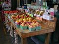
| 09/14/2002 08:33:00 PM | Farmer's Marketby GuillermoComment by autool: Composition: Subject Placement, Cropping, Background6, Technical: Focus, Exposure, Lighting, Processing5, Appeal: Is it Interesting, Motivating, Etc.? 5, Total Averaged Rating5. Autool |
| 09/14/2002 02:02:00 PM | |
| 09/10/2002 11:52:00 PM | Farmer's Marketby GuillermoComment by mjcecil: Caught ya, Guillermo! Excellent color range. For this shot, I might have turned up the saturation on Pshop a little (or even in camera, if yours supports it!), but the composition is excellent! I am rating this one high, particularly because it is an as-is shot, rather than a direct manipulated composition like so many of the others. - mjcecil |
| 09/10/2002 06:08:00 PM | Farmer's Marketby GuillermoComment by Renee707: Looks very inviting! Nice color, sharp focus and good depth of field. I love these roadside fruit stands...we have them where I live, too! |
| 09/10/2002 04:47:00 PM | Farmer's Marketby GuillermoComment by LindaLee: I like the sort of "farmers market" feel of the photo, but find a lot of the surrounding "background" to be distracting. The shiny potato chip bags and the black hole of the door behind the chip display draw my eyes there, and away from the fruits and vegs. I love the hanging garlic, and think that I would have liked to have seen a shot taken from an angle that focused on the garlic and the fruits and vegs, cutting out some of the background. lhall-7 |
| 09/09/2002 08:34:00 PM | Farmer's Marketby GuillermoComment by yousuck: I feel like it lacks focus, although maybe it just needs to be cropped. The potato chip rack in the upper left corner hurts, as does the cleaner (etc) in the upper right corner. I think by sacrificing some of the stand, you could come away with a much cleaner pic. |
| 09/07/2002 12:14:00 AM | Hurry boys!!!by GuillermoComment by sjgleah: Too much extraneous stuff, and i don't see enuf of the kids to really "get" the mood. Nice idea. 5 sjgleah |
Home -
Challenges -
Community -
League -
Photos -
Cameras -
Lenses -
Learn -
Help -
Terms of Use -
Privacy -
Top ^
DPChallenge, and website content and design, Copyright © 2001-2026 Challenging Technologies, LLC.
All digital photo copyrights belong to the photographers and may not be used without permission.
Current Server Time: 07/15/2026 02:18:32 PM EDT.
|