| Image |
Comment |
| 09/24/2003 04:37:44 PM |
|
| 09/24/2003 03:11:46 PM |
|
| 09/24/2003 01:49:27 PM |
|
| 09/24/2003 09:36:06 AM |
TACKYby boyte1Comment by Gracechild7: Cute. Could use more clarity, but dof is good. I wouldn't want everything in perfect focus. More pins would have gotten rid of black spaces. |
| 09/24/2003 03:26:37 AM |
|
| 09/24/2003 02:32:18 AM |
TACKYby boyte1Comment by TooCool: Awesome colors...Great focus...Love the composition...DOF is a touch shallow though. Nicely original for this theme!!! I say 7!
TC |
| 09/22/2003 09:51:40 PM |
TACKYby boyte1Comment by faidoi: Very busy shot. This would make for a good greeting card or postcard with a good quote. Putting a light color would help to make the push pins pop out of the picture. There's a lot to look at. Focusing in more may make it more interest. |
| 09/22/2003 12:58:53 PM |
TACKYby boyte1Comment by justine: Not a bad shot the light is just a bit harsh. Good subject for the challenge. |
| 09/22/2003 09:22:52 AM |
|
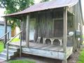
| 09/03/2003 12:00:37 PM |
The Old Home P;aceby boyte1Comment by cpanaioti: *Critique Club*
General: Nice documentary shot. It would be interesting to see different aspects of this building inside and out maybe as a collection.
Composition: The building is well positioned within the frame though maybe cropped a little too tight on the sides. This was probably done to eliminate as much of the bright background as possible.
Exposure: This is a difficult situation with the bright background. About 1/2 stop more exposure would probably have brought out more detail in the wood.
Impact: On a scale of 1 to 10 I have to say this is about a 6. More impact would probably be achieved if there was more contrast to show off the detail of the wood.
Good find.
Colette |
Home -
Challenges -
Community -
League -
Photos -
Cameras -
Lenses -
Learn -
Help -
Terms of Use -
Privacy -
Top ^
DPChallenge, and website content and design, Copyright © 2001-2026 Challenging Technologies, LLC.
All digital photo copyrights belong to the photographers and may not be used without permission.
Current Server Time: 07/17/2026 12:53:01 AM EDT.