| Image |
Comment |
| 07/21/2002 11:50:00 PM |
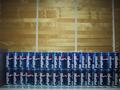
Addicted to Pepsi?by snergurComment by drewmedia: Your lighting is very poor and uneven, and I think the wood is really unnecessary. I'd save a few more dollars and fill the whole image with cans :) |
| 07/21/2002 11:44:00 PM |
|
| 07/21/2002 10:32:00 PM |
Addicted to Pepsi?by snergurComment by jimmsp: Average for me - a 5. Looks like flash dominated middle boards. Perhaps # cans should have dominated the photo, not the background. |
| 07/21/2002 06:14:00 PM |
|
| 07/21/2002 04:19:00 PM |
Addicted to Pepsi?by snergurComment by Patella: OK, someone like Pepsi WAY too much. But beyond that, I find myself simply just thinking, "Ummmm, ok." Trying to figure out what this shot is supposed to convey and I'm just not getting it. About the only suggestion I can make is that you stack enough of the cans so that you could shoot an entire "wall" of them instead of just two rows -- the table and windowblind aren't doing anything for your presentation. |
| 07/20/2002 08:51:00 PM |
Addicted to Pepsi?by snergurComment by GeneralE: Hmm...would I be impressed or depressed if all the little tab-pushers were obviously up indicating a stack of empty cans? |
| 07/20/2002 11:35:00 AM |
Addicted to Pepsi?by snergurComment by Gene L.: I like the concept of the photo, the color and symmetry of the cans, and the reflection in front. I think that the background weakens the shot though and should have been a solid white or high contrast color. I think also to crop the front so the table edge doesn't show or better yet, to have more front surface to reflect the full image of the cans. |
| 07/19/2002 08:29:00 PM |
|
| 07/19/2002 12:14:00 PM |
Addicted to Pepsi?by snergurComment by FranziskaLang: you were obviously trying to create a repeating pattern here, and the idea is good, however, i would've cropped the shot so that the cans at either side are partially cropped off, implying a continuation, and i would've also turned the labels to face all the same way. not sure how i would've used the space above the cans, i think it's too much and detracts from the repeating pattern aspect. just my thoughs. -- gr8photos (4) addition: just occured to me, it would've been fun to fill the frame with the cans and place one different can (coke?) in there somewhere just to create a break in the pattern. |
| 07/19/2002 04:42:00 AM |
Addicted to Pepsi?by snergurComment by tmacan: It's tilted to the right. Object on the left is ditracting. Good choice of blue-yellow contrast, but use of flash is bad choice. Also, geting closer and capturing only details could work much better. Good effort. |
Home -
Challenges -
Community -
League -
Photos -
Cameras -
Lenses -
Learn -
Help -
Terms of Use -
Privacy -
Top ^
DPChallenge, and website content and design, Copyright © 2001-2026 Challenging Technologies, LLC.
All digital photo copyrights belong to the photographers and may not be used without permission.
Current Server Time: 07/16/2026 12:05:33 AM EDT.