| Image |
Comment |
| 08/12/2002 12:36:00 AM |
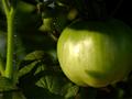
newbieby aelithComment by LindaLee: Nice composition, nice balance of light and shadow, and I love the reflections off of all the tiny little "hairs". lhall |
| 08/25/2002 02:18:00 AM |
untitledby aelithComment by focus: I can't believe some losers (3 to be exact) gave you a "1" on this picture; and 13 gave you a "2"! I personally gave an "8." People that graded this so poorly either need to get their monitors fixed or have the eyes examined. I really have to wonder about the motive of those that graded this picture so poorly. |
| 08/11/2002 03:13:00 PM |
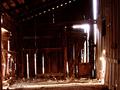
untitledby aelithComment by nightfall: great idea. I like the shadows on the ground and the way the light bleeds through the cracks in the barn. there is also a nice gradient of values from the upper left to the lower right. |
| 08/10/2002 08:25:00 PM |
|
| 08/10/2002 10:53:00 AM |
|
| 08/09/2002 09:32:00 PM |
|
| 08/09/2002 05:17:00 PM |
untitledby aelithComment by RedRuthann: I'm being frank - not to offend. The cropping, composition and distance is good. The light is harsh with too much fringing. I like the idea very much, but it seems that the process was executed poorly. This is just my opinion. 5 Ruthann |
| 08/09/2002 02:15:00 AM |
|
| 08/08/2002 09:22:00 PM |
untitledby aelithComment by stephan: Beautiful photo! I like this a lot. Only thing I could nit-pick about is that the bright light in the upper right corner does not fit to the rest of the photo. It's a touch too bright and also has a blue tint. If it would be the same like the bright light in the lower right corner (on the right wall of the barn) then it would be perfect. Unfortunately I don't have a suggestion how this could be achived. -Stephan |
| 08/08/2002 02:31:00 PM |
untitledby aelithComment by jmsetzler: interesting play with light here... the blown out glow through the back of this barn looks pretty interesting :) good work - jmsetzler |
Home -
Challenges -
Community -
League -
Photos -
Cameras -
Lenses -
Learn -
Help -
Terms of Use -
Privacy -
Top ^
DPChallenge, and website content and design, Copyright © 2001-2026 Challenging Technologies, LLC.
All digital photo copyrights belong to the photographers and may not be used without permission.
Current Server Time: 04/01/2026 10:11:15 PM EDT.