Without my headby
eirasiComment by Lustre: Greetings from the Critique Club
Technical elements
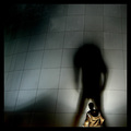
Technically there is very little wrong with this photo - good sharpness, good colour, good control of a difficult exposure.
Composition
I really like the composition of this shot - only partially including the person (yourself) and having them walk into the frame, away from the camera, works really well. The geometric lines of the panelling and in particular the rivets really provide an interesting, yet non distracting, background.
Border / Title
The border is the ideal colour (black) and even though it's really large I wouldn't specifically say that it is too big for this shot. The title is good.
Personal / Emotional qualities
I'm not sure if not including the head was the original plan or just something you realised once you had taken the first shot. It's ok, but I'm not sure what it's trying to convey emotionally. Personally speaking I would have liked the shot just as much if the head had been included.
Summary
It's a very good shot, and the shadow really dominates as the key element in the photo - which is perfect for the challenge. It is really difficult to say how to improve this shot - there is nothing really wrong with it at all. Good work!