| Image |
Comment |
| 08/10/2002 09:45:00 PM |
|
| 08/10/2002 05:10:00 PM |
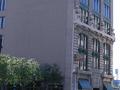
Seventh Street Grilleby mcrochipComment by Hendrik: This looks to be very low resolution. Or maybe it is a very small crop from a much larger picture. Either way, it's just too grainy and blocky for me. Sorry. |
| 08/10/2002 04:15:00 PM |
Seventh Street Grilleby mcrochipComment by UberFish: This only just passes my quality threshold, beyond which I start to make impolite comments. But you just made it, so: The whole thing appears lopsided. Youve used the right corner as your guide, but you should have used the nearest one, as that is in the center of the picture. There is a very large area of boring wall and hedge. Use a verticle frame and focus more on the front of the building, as that has more interest. You have chopped the entrance to the building off, it may have been ugly or had cars in front, but do try to show entrances when doing buildings, they give scale, and lead you into the picture. Youve used too much compression, Dont go below 70% comprression for these challenges. |
| 08/10/2002 11:58:00 AM |
Seventh Street Grilleby mcrochipComment by RLS: Colors look off.. Depth of field lacking (Due to the focus on the flora on the left.)... Makes photo look OOF ... RLS |
| 08/10/2002 09:42:00 AM |
|
| 08/09/2002 07:29:00 PM |
Seventh Street Grilleby mcrochipComment by Swashbuckler: I'll keep this short, left half is somewhat negative space (intensional?) The sky is blown out (intensional, too?) The sign is almost readable. Best suggestion: walk up closer to the building and take the shot in portrait. 6 Swash |
| 08/08/2002 07:28:00 AM |
Seventh Street Grilleby mcrochipComment by floyd: Really needed to be framed to show the grille better - or the sign better. There's a lot of blank wall here. Good choice of subject though. |
| 08/07/2002 11:13:00 PM |
Seventh Street Grilleby mcrochipComment by karmat: I think the sign, since that seems to be what you are focusing on, should be more important in the picture. Also, I think cropping the right side windows would help. I like the way the bushes/tress lead the eyes to the building. karmat |
| 08/07/2002 04:48:00 AM |
Seventh Street Grilleby mcrochipComment by jsabbarton: Front on would be better (I think) and there seems to be far too much empty space and very little subject... This is just my opinion, good luck... |
| 08/06/2002 02:41:00 PM |
|
Home -
Challenges -
Community -
League -
Photos -
Cameras -
Lenses -
Learn -
Help -
Terms of Use -
Privacy -
Top ^
DPChallenge, and website content and design, Copyright © 2001-2026 Challenging Technologies, LLC.
All digital photo copyrights belong to the photographers and may not be used without permission.
Current Server Time: 07/09/2026 03:46:57 PM EDT.