| Image |
Comment |
| 04/06/2009 08:27:37 PM |
|
 Photographer found comment helpful. Photographer found comment helpful. |
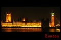
| 04/06/2009 07:09:26 PM |
Londonby PixelstateComment by Teafran: There is only one thing wrong with this and it's the clock face - the white dot just doesn't work with the rest of the image. Also, the dark area on the right of the building doesn't help the overall postitive effort. The font is good, but the color should have contrasted less with the overall gold tone of the image. |
| Photographer found comment helpful. |
| 04/06/2009 06:01:03 PM |
|
| Photographer found comment helpful. |
| 04/06/2009 03:21:10 PM |
|
| Photographer found comment helpful. |
| 04/06/2009 01:18:06 PM |
Natures Lensby PixelstateComment by George: This is the second abstract one I see in this, but in this case, it has an element that has been overused (especially here at DPC). Nice idea, good colors, a very good image overall... but it doesn't pop as much because of the technique's overuse in the last few years. |
| Photographer found comment helpful. |
| 04/06/2009 11:28:37 AM |
|
| Photographer found comment helpful. |
| 04/06/2009 09:45:08 AM |
Londonby PixelstateComment by KarenNfld: Good nightshot! Not sure I like the choice of red for the text, but otherwise this would make a good postcard.
One thing that has always bothered me, why don't they light up that one section of the parliament buildings? |
| Photographer found comment helpful. |
| 04/06/2009 09:17:44 AM |
|
| Photographer found comment helpful. |
| 04/06/2009 12:20:44 AM |
|
| Photographer found comment helpful. |
| 04/06/2009 12:09:44 AM |
|
| Photographer found comment helpful. |
Home -
Challenges -
Community -
League -
Photos -
Cameras -
Lenses -
Learn -
Help -
Terms of Use -
Privacy -
Top ^
DPChallenge, and website content and design, Copyright © 2001-2026 Challenging Technologies, LLC.
All digital photo copyrights belong to the photographers and may not be used without permission.
Current Server Time: 06/22/2026 10:36:30 PM EDT.