| Image |
Comment |
| 04/30/2006 01:10:35 AM |
|
 Photographer found comment helpful. Photographer found comment helpful. |
| 04/29/2006 11:36:49 PM |
"Window", Framedby LN13Comment by Melethia: Perfect for the challenge! The contrasting angles between the two windows work well and I love the simple color scheme. About the only thing I'd change is to somehow tone down the brightness on the wall on the right. Nice work. |
| Photographer found comment helpful. |
| 04/29/2006 10:05:50 PM |
|
| Photographer found comment helpful. |
| 04/29/2006 09:37:57 PM |
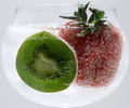
Fruit Bubblyby LN13Comment by 2mccs: the red doesn't come through well - looks more orange but great bubbles |
| Photographer found comment helpful. |
| 04/29/2006 07:46:12 PM |
|
| Photographer found comment helpful. |
| 04/29/2006 06:16:11 PM |
|
| Photographer found comment helpful. |
| 04/29/2006 04:06:59 PM |
|
| Photographer found comment helpful. |
| 04/29/2006 03:32:05 PM |
|
| Photographer found comment helpful. |
| 04/29/2006 03:16:59 PM |
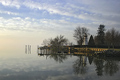
Reflections at Concord Pointby LN13Comment by Bear_Music: If you compare this shot with your "heron" shot at the same location, looking at composition only, you can see, I am sure, how much stronger the other one is. Here you have a surprsingly static composition considering the grace of allt he component elements. It's dividing into 3 horizontal bands, none of the alone especially powerful or compellin.
You have other issues as well, especially with sharpening, which has haloed the poles, and also with not having the image aligned vertically (the lighthouse is falling over, and there's no real horizon to worry about, so...)
On the plus side, the merging of sky and water is fantastic, positively ephemeral. As with the other, I'd love to play with this one if you sent me the original. It's the best way I have of showing what I mean, which is why I do so much of my "commenting" in the forums where evryone can study the work being done. |
| Photographer found comment helpful. |
| 04/29/2006 03:11:32 PM |
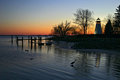
Concord Point Lighthouse with Heronby LN13Comment by Bear_Music: Larry, this is potentially an absolute KILLER good shot. I'm glad you asked for comments and I got to see this.
One interesting thing; the horizon does not "feel" quite level even though it actually is. The reason why is cuz you've pointed the camera down quite a bit and so the lighthouse itself is leaning outwards near the top of the frame. Now, this can be fized with POS perspective control, and I'd be inclined to try that.
Another issue is the radial banding in the sky; I'm not sure if that's just an artifact of compression or visible at a larger size as well; but I do know that I process a lot of shots similar to this and don't have a problem with it. I see it's a 98kb image, so that may explain it.
Finally, I see here a prime candidate for some subtle contrast masking. If you'd like to send me the original jpg (or a full-size jpg from RAW if that's what you shot) I'd love to experiment with this shot. My e-mail's on my profile. |
| Photographer found comment helpful. |
Home -
Challenges -
Community -
League -
Photos -
Cameras -
Lenses -
Learn -
Help -
Terms of Use -
Privacy -
Top ^
DPChallenge, and website content and design, Copyright © 2001-2026 Challenging Technologies, LLC.
All digital photo copyrights belong to the photographers and may not be used without permission.
Current Server Time: 07/16/2026 02:16:12 PM EDT.