| Image |
Comment |
| 01/27/2007 04:19:34 PM |
Twigsby kawesttexComment by Germaine: Good idea, but the portrait orientation is very awkward. To my eye, there's too much space at the top. |
 Photographer found comment helpful. Photographer found comment helpful. |
| 01/27/2007 02:57:46 PM |
|
| Photographer found comment helpful. |
| 01/27/2007 11:30:25 AM |
|
| Photographer found comment helpful. |
| 01/27/2007 06:50:02 AM |
Twigsby kawesttexComment by alexjack: I really like this one, it just stopped me in my tracks. Im not sure how you did it but its great. I'm not sure I like the vertical lines between the elements, would have been better w/o them (imho) but still very good ..
- 9 -
Jack |
| Photographer found comment helpful. |
| 01/26/2007 09:50:26 AM |
|
| Photographer found comment helpful. |
| 01/26/2007 12:47:26 AM |
|
| 01/25/2007 02:01:25 AM |
|
| Photographer found comment helpful. |
| 01/24/2007 11:42:21 PM |
|
| Photographer found comment helpful. |
| 01/24/2007 11:25:07 PM |
|
| Photographer found comment helpful. |
| 01/24/2007 02:03:01 PM |
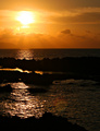
Island Sunsetby kawesttexComment by DrewLong: The picture works much better for me with the water in the forgound cropped out starting the picture with the first the 2nd strip of rock in the foreground. it allows my eyes to admire the contrast of rock and water but yet still focus mainly on the beautiful lines and color of the light rays. |
| Photographer found comment helpful. |
Home -
Challenges -
Community -
League -
Photos -
Cameras -
Lenses -
Learn -
Help -
Terms of Use -
Privacy -
Top ^
DPChallenge, and website content and design, Copyright © 2001-2026 Challenging Technologies, LLC.
All digital photo copyrights belong to the photographers and may not be used without permission.
Current Server Time: 06/11/2026 04:50:20 PM EDT.