| Image |
Comment |
| 05/21/2004 09:41:38 AM |
Nail Biterby beckettbootsComment by hannafate: I think black-and-white was a poor choice for this shot. Grey skin looks dead. Either sepia tone or full color would have been more appealing. I am impressed by the clear focus and dynamic composition. |
 Photographer found comment helpful. Photographer found comment helpful. |
| 05/19/2004 08:06:28 AM |
Nail Biterby beckettbootsComment by Count: Nice macro shot. Think I might have prefered color for once though. Nice sharpness, contrast and DOF though. |
| Photographer found comment helpful. |
| 05/19/2004 01:03:52 AM |
|
| Photographer found comment helpful. |
| 05/19/2004 12:24:42 AM |
|
| Photographer found comment helpful. |
| 05/12/2004 02:18:51 AM |
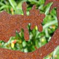
sheet rustby beckettbootsComment by photom: * Greetings from the Critique Club *
cybele,
First - Congratulations on being in the top 10% on only your 3rd challenge! There are many, many members who have only dreamed of a finish that high.
Your image is one I commented on during the voting, with "Your image, intentional or not, is an optical illusion. Sometimes it looks like the rusty area is the object and other times like the green area is the object. Nice rust and texture therin. If you rotate it 90 degrees counter clockwise it may be a stronger image - kinda like a human figure. If you re-shoot try to tone down the background a bit by making those bright yellow / orange objects fall into a shadowed area."
I stand by my earlier comments - and note that most of the commenters have positive comments about your entry. So, having said all that - it's time to take a great submission into a ribbon winner. How can we do that?
a) Most of the suggestions for improvement revolved around composition. Studying the image objectively - as if it were someone else's image - you may note that: 1) There is a stranded triangle at the bottom right corner, which means the image doesn't have much of a "base" to work from.
b) Maybe more importantly, a few felt like the image would be stronger if the left edge became the bottom.
But - hey - don't lose the fact that this image was rated better than nearly 400 other submissions. Now it's not a matte of starting over - but instead - just "tweaking" what you've already done.
Keep up the great work.
|
| Photographer found comment helpful. |
| 05/11/2004 12:51:38 PM |
|
| Photographer found comment helpful. |
| 05/10/2004 06:56:28 PM |
|
| Photographer found comment helpful. |
| 05/10/2004 12:56:32 PM |
sheet rustby beckettbootsComment by autool: Composition: Subject Placement, Cropping, Background 6
Technical: Focus, Exposure, Lighting, Processing 6
Appeal: Is it Interesting, Motivating, Etc.? 5
How well does it meet the challenge: 10
Total Averaged Rating 6.75 Dick
|
| Photographer found comment helpful. |
| 05/09/2004 03:21:08 PM |
|
| Photographer found comment helpful. |
| 05/08/2004 09:33:52 PM |
sheet rustby beckettbootsComment by orussell: Composition: Subject Placement, Cropping, Background 5
Technical: Focus, Exposure, Lighting, Processing 6
Appeal: Is it Interesting, Motivating, Etc. 4
How well does it meet the challenge: 7
Total Averaged Rating(Rounded) 6
|
| Photographer found comment helpful. |
Home -
Challenges -
Community -
League -
Photos -
Cameras -
Lenses -
Learn -
Help -
Terms of Use -
Privacy -
Top ^
DPChallenge, and website content and design, Copyright © 2001-2026 Challenging Technologies, LLC.
All digital photo copyrights belong to the photographers and may not be used without permission.
Current Server Time: 07/16/2026 10:07:36 AM EDT.