| Image |
Comment |
| 05/13/2004 12:12:06 PM |
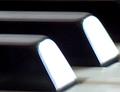
Melodyby clearshotComment by alyrivero: Hard to tell what it was at first glance - now I see it's paino keys. Nice attempt - would have preferred it in focus, more contrast. The composition would have been GREAT! Nice try... |
| 05/13/2004 11:00:37 AM |
|
| 05/13/2004 02:42:36 AM |
|
| 05/12/2004 08:15:33 PM |
Melodyby clearshotComment by amylyn: Mmm not sure of the opposites on this? And the blown out spots on the black keys is very distracting.. |
| 05/12/2004 08:04:08 PM |
|
| 05/12/2004 03:52:02 PM |
Melodyby clearshotComment by wkoffel: I don't understand why the shot is so blurry. And I think the balance of white abd black keys needs to be better to work for the opposites theme. Keep at it! |
| 05/12/2004 03:40:29 PM |
|
| 05/12/2004 02:07:26 PM |
Melodyby clearshotComment by Neuferland: If this was in focus and the end of the keys weren't blown out with light this would probably rate an 8 or above, I like the crop and the composition of the shot but the other factors hurt it a great deal. A 3 |
| 05/12/2004 02:05:13 PM |
Melodyby clearshotComment by vsmed1968: I don't really like the glare on the front of the black keys. I don't know if it was intentional, or not so I am scoring as if it was. good luck. |
| 05/12/2004 12:36:57 PM |
Melodyby clearshotComment by NRRon: Seems to be out of focus. Why are the faces of the black keys white. |
Home -
Challenges -
Community -
League -
Photos -
Cameras -
Lenses -
Learn -
Help -
Terms of Use -
Privacy -
Top ^
DPChallenge, and website content and design, Copyright © 2001-2026 Challenging Technologies, LLC.
All digital photo copyrights belong to the photographers and may not be used without permission.
Current Server Time: 07/15/2026 02:06:49 PM EDT.