| Image |
Comment |
| 05/05/2004 01:10:38 PM |
|
 Photographer found comment helpful. Photographer found comment helpful. |
| 05/05/2004 11:15:40 AM |
|
| Photographer found comment helpful. |
| 04/30/2004 09:46:29 AM |
|
| 04/28/2004 08:12:44 PM |
|
| 04/28/2004 07:47:57 PM |
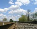
near & farby laybackComment by melismatica: Without the title, which doesn't really convey much, the idea of near and far isn't really apparent from this photo. As an image it lacks a focal point. The railroad tracks just point to a drab landscape of washed out looking trees. |
| 04/28/2004 01:27:37 PM |
|
| Photographer found comment helpful. |
| 04/28/2004 05:41:37 AM |
near & farby laybackComment by coolhar: moving a foot forward would have removed that distracting weld in the lower left corner |
| Photographer found comment helpful. |
| 04/21/2004 12:03:13 AM |
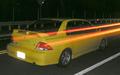
Ghost Wheelsby laybackComment by Neuferland: Greetings from the Critique Club!
Very interesting shot for the challenge. I like the idea but the shot itself leaves much to be desired for me. First the graininess of the shot overall is very distracting to me and really hurts the overall effect. I know you are going for a ghost effect and you did acheive that to a point but what it really looks like to me is a double exposure shot, one with the car sitting still and another with the car driving through the shot, hence the orange/red streak for the tail lights. I think if the shot didn't have the streak through the middle of it, it would have a much better impact overall.
The shot is also a bit too dark in some spots and overly bright in others (like the back of the car, the plates are glaring at me, distracting me again) The road looks more ghostly than the car does.
It's a good idea and with some adjustments to the light and working on getting the streaks out it has a lot of potential to be a really cool shot, a bit more light and contrast to really make the color of the car pop.
Good Luck In Future Challenges!
Deannda
DNeufer@stny.rr.com if you have any questions or want to discuss this further! |
| Photographer found comment helpful. |
| 04/18/2004 04:51:56 AM |
|
| 04/15/2004 01:21:09 PM |
|
Home -
Challenges -
Community -
League -
Photos -
Cameras -
Lenses -
Learn -
Help -
Terms of Use -
Privacy -
Top ^
DPChallenge, and website content and design, Copyright © 2001-2026 Challenging Technologies, LLC.
All digital photo copyrights belong to the photographers and may not be used without permission.
Current Server Time: 07/15/2026 02:26:03 PM EDT.