| Image |
Comment |
| 05/14/2004 09:28:17 AM |
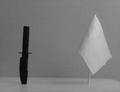
Deadly Oppositesby rigelComment by sailracer_98: The elements in this photo look blurry. There is too much gray/white in this photo for my taste- it makes everything look dull. |
| 05/13/2004 05:07:03 PM |
|
| 05/13/2004 03:02:13 PM |
|
| 05/13/2004 01:44:50 PM |
Deadly Oppositesby rigelComment by paynekj: Having both objects leaning over to the right rather upsets the impact you were obviously trying for. An interesting image otherwise. |
| 05/13/2004 12:59:48 PM |
Deadly Oppositesby rigelComment by boomer: This picture is poorly lit, out of focus, dully composed. What's the white thing -- a surrender flag? Are they stuck to some sort of table? Why? There's no dynamic tension in the picture. |
| 05/13/2004 12:33:52 PM |
|
| 05/13/2004 02:15:24 AM |
|
| 05/12/2004 11:25:35 PM |
Deadly Oppositesby rigelComment by trying2bstill: Good choice of opposites. There is too much negative space, its out of focus, and there really doesn't seem to be any detail in the knife. I would like to see you rework this idea with a little more creativity. 3 |
| 05/12/2004 07:36:28 PM |
Deadly Oppositesby rigelComment by justine: My suggestion for imporvement here would be less of a staged look. This is just a boring set up and needs something else to help it connect. A hat, tank, better background, tree branch, army men...etc. Maybe the knife on the flag....? The noise is distracting from the shot. ?More light and a lower ISO for less noise. Best of luck in the challenge. |
| 05/12/2004 03:52:18 PM |
Deadly Oppositesby rigelComment by Triplethreat: This photograph is so poorly done I can't imagine why you ever submitted it to the contest. Not only is it out of focus and grainy, but it is so uninspiring as to be brain-deadening. A knife near a white flag... The lighting is terrible, there is virtually no contrast in this photo, and the composition is so ill-conceived as to be mind-boggling. There is nothing interesting about this photograph whatsoever. Please don't waste our time posting photos like this. |
Home -
Challenges -
Community -
League -
Photos -
Cameras -
Lenses -
Learn -
Help -
Terms of Use -
Privacy -
Top ^
DPChallenge, and website content and design, Copyright © 2001-2026 Challenging Technologies, LLC.
All digital photo copyrights belong to the photographers and may not be used without permission.
Current Server Time: 07/15/2026 12:08:12 PM EDT.