| Image |
Comment |
| 10/27/2004 12:21:58 PM |
|
 Photographer found comment helpful. Photographer found comment helpful. |
| 10/27/2004 06:23:34 AM |
Withoutby bobdaveantComment by Bud: Nice photo, the image is grainy, but maybe you meant it to be grainy. |
| Photographer found comment helpful. |
| 10/27/2004 05:00:54 AM |
|
| Photographer found comment helpful. |
| 10/27/2004 01:13:04 AM |
Withoutby bobdaveantComment by MrYu: You know, this portrait may or may not represent poverty, qualify for challenges, yada, yada. It doesn't even matter. This is a 10 from me without even thinking. I'd give this a 20 if i could. Bravo. |
| Photographer found comment helpful. |
| 10/26/2004 01:01:13 PM |
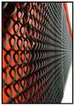
Fenceby bobdaveantComment by Bud: This is really nice, the red back works well for the fence. 8. |
| Photographer found comment helpful. |
| 10/25/2004 06:59:38 PM |
|
| Photographer found comment helpful. |
| 10/25/2004 04:03:55 PM |
Fenceby bobdaveantComment by Jeileen: Did you think to open the right side up to a white space? White outerrim of border is too thick. Good dof. |
| Photographer found comment helpful. |
| 10/25/2004 02:36:43 PM |
Fenceby bobdaveantComment by nordicgirl: Really like this point of view. Good DOF. Just somehow feels to crop these white parts off. |
| Photographer found comment helpful. |
| 10/25/2004 12:28:02 PM |
Fenceby bobdaveantComment by redmoon: yes. i'd say this fits pretty well. i'd say the orientation is perhaps not best suited for this sort of picture for two reasons; one is that ones eyes are drawn towards the right, which ends abruptly, and second is the expanse of white in the corners kind of unbalances the overall shot. that minor compliant aside, i think this is brilliant - i love how bold the black and red looks at the core of the shot, and the subject matter though not obvious in the street, fits the implied line thing very well. good thinking and well executed. 8. |
| Photographer found comment helpful. |
| 10/25/2004 10:35:36 AM |
|
| Photographer found comment helpful. |
Home -
Challenges -
Community -
League -
Photos -
Cameras -
Lenses -
Learn -
Help -
Terms of Use -
Privacy -
Top ^
DPChallenge, and website content and design, Copyright © 2001-2026 Challenging Technologies, LLC.
All digital photo copyrights belong to the photographers and may not be used without permission.
Current Server Time: 06/16/2026 07:24:07 PM EDT.