| Image |
Comment |
| 07/15/2004 09:19:21 PM |
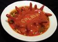
Splashby BearSilberComment by photom: A great idea and setup - except for the shapes that are supposed to look like they are splashing upward. They appear very awkward. Great use of the alphabet soup letters - I think you may be the only one to do so. Black background and almost square format were both good choices. |
| 07/15/2004 04:51:36 PM |
Splashby BearSilberComment by KiwiChris: Is this plastisene? (sp). You've obviously gone to a great deal of effort to set this up, but it looks like at the last step you got some motion blur in the shot... |
| 07/15/2004 11:36:48 AM |
|
 Photographer found comment helpful. Photographer found comment helpful. |
| 07/15/2004 08:30:29 AM |
|
| 07/14/2004 11:40:27 PM |
|
| 07/14/2004 11:18:55 PM |
|
| 07/14/2004 04:30:15 PM |
|
| 07/14/2004 04:17:15 PM |
|
| 07/14/2004 04:12:18 PM |
|
| 07/14/2004 03:54:37 PM |
Splashby BearSilberComment by Allyrellia: Wish the colors had been a bit brighter here, it would have made for a more fun, exciting photo, but this is still nice regardless, good job! |
Home -
Challenges -
Community -
League -
Photos -
Cameras -
Lenses -
Learn -
Help -
Terms of Use -
Privacy -
Top ^
DPChallenge, and website content and design, Copyright © 2001-2026 Challenging Technologies, LLC.
All digital photo copyrights belong to the photographers and may not be used without permission.
Current Server Time: 07/16/2026 01:32:12 AM EDT.