| Image |
Comment |
| 11/22/2005 07:29:14 PM |
pdg-logo-1.jpgby pgattComment by oOWonderBreadOo: you know, I'm not totally sold on the logo and I hope you don't mind but I played around with it. I just felt it was a little bland and a little bright on the white card...
 |
 Photographer found comment helpful. Photographer found comment helpful. |
| 11/15/2005 11:54:21 PM |
|
| Photographer found comment helpful. |
| 11/15/2005 01:12:54 PM |
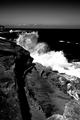
Face Offby pgattComment by justin_hewlett: Awesome contrasty B/W, I just with that the water wasn't blown-out. That's the only thing detracting from this otherwise perfect photo. The foreground detail is awesome. B/W works well here. Nice job. |
| Photographer found comment helpful. |
| 11/13/2005 09:32:54 AM |
Face Offby pgattComment by grus: The shadows are very dark, the highlights bright... conventionally speaking I'd say this is too contrasty, but it does have a strong impact here. |
| Photographer found comment helpful. |
| 11/11/2005 07:32:59 PM |
Face Offby pgattComment by Azrifel: Nice content, composition and B&W toning.
Your CCD/CMOS needs serious cleaning though. :) |
| Photographer found comment helpful. |
| 11/11/2005 06:16:11 AM |
Face Offby pgattComment by insane: I like the view point. The white crest of the wave gives so much dynamic.
What I don't like it the post processing. I can see that this was done to emphasize thw water but in the process balance was lost. It has beed over done. I think that you chose a place where these waves are not random. It seems that they re-appear. You could have taken adventage of having a digital camera and you could have studied the subject more thoroughly. In this case a film camera would be better, as it would force you to think about the scene while making the shot not after.
It's a 7 |
| Photographer found comment helpful. |
| 11/10/2005 11:21:29 PM |
Face Offby pgattComment by fotomann_forever: Red filter? Love the contrast and composition and the choice of black & white works really well. 10. Great work. |
| Photographer found comment helpful. |
| 11/10/2005 08:36:46 PM |
Face Offby pgattComment by Apee: hard for the eye... a way too much contrast there... 4 |
| Photographer found comment helpful. |
| 11/09/2005 06:14:44 PM |
Face Offby pgattComment by MQuinn: I really like the effect here, the title is very fitting. What I don't like is black (line/shadow/fence?) in the lower left my eye keeps getting pulled to it. |
| Photographer found comment helpful. |
| 11/09/2005 04:16:12 PM |
|
| Photographer found comment helpful. |
Home -
Challenges -
Community -
League -
Photos -
Cameras -
Lenses -
Learn -
Help -
Terms of Use -
Privacy -
Top ^
DPChallenge, and website content and design, Copyright © 2001-2026 Challenging Technologies, LLC.
All digital photo copyrights belong to the photographers and may not be used without permission.
Current Server Time: 07/15/2026 04:46:07 PM EDT.