life:death/green:rustby
AlexHugelComment by Fotowereld: :: Critique Club Comment ::
A lot has already been said in other comments, I'll try to put some things together:
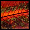
First of all, it is obvious that you interpreted "Rust" as a colour and as a state (death) which is interesting and daring, since it is not what most people will think of. The choise of title is perfect, because it explains people what you had in mind. I can see how you match rust, this orange colour and death, but in this case the orange is a very bright and warm orange, which I don't match with death quickly.
The light comes from behind the leaf and shines through some of the cells, which gives the photo a wonderful structure, especially in the green parts. Because of the indirect light there unfortunately are some dark places in the photo, instead of deep rusty colours and fresh green all over. The dark places do match the theme 'death' more though..
You mention in your own comments that you wanted to represent a sort of life and death 'yin-yang'. I reckon you mean the opposite character of the two. Again, the use of colours fits perfectly with this idea, but the colours are not really seperated, they more blend into eachother at the edges.. The fact that you have your picture 'cut' into two by the main vein suggests more the idea of a yin and yang. The line not being straight adds more tension to the picture, which is great!
You took the shot from real close and cropped the photo real tight. In combination with the firm black border, the whole gets a 'tight' feeling..it's almost like I'm on the leaf myself! For the structure of the leaf, the closeness is a good thing, but the border is a little bit too much..
The overall feeling of this picture is a good one!
Fotowereld.