| Image |
Comment |
| 06/01/2003 11:07:48 PM |
|
 Photographer found comment helpful. Photographer found comment helpful. |
| 06/01/2003 10:45:07 PM |
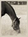
Buckoby RLSComment by frisca: I'd lose the heavy border because it is distracting from an otherwise wonderful shot. I love the portrait-style presentation and the crop which focusses our attention on the mouth and nose of this horse. The textures of the field are also wonderfully lit. |
| Photographer found comment helpful. |
| 06/01/2003 08:33:14 AM |
Buckoby RLSComment by casualguy: Listen here BUCKO! (just wanted to say that). Nicely composed, love the area of the horses head in the grass, nice! (maybe a bit more cropping at the top would have appealed to me more, not sure). Beautiful animal, great job! |
| Photographer found comment helpful. |
| 05/31/2003 09:11:32 PM |
Buckoby RLSComment by LindaLee: Love the shot, not crazy about the border. The shot is beautiful in it's simplicity, the depth of field is perfect, and I really like the composition. I would have wished for a bit more light on the horse, but nevertheless, well done. |
| Photographer found comment helpful. |
| 05/31/2003 11:39:18 AM |
Buckoby RLSComment by sher: beautiful tones and i love the cropping. well done! |
| Photographer found comment helpful. |
| 05/29/2003 03:24:55 PM |
Buckoby RLSComment by ruthiek: Very nice -- I like the tones and the frame, as well as overall mood of the photo. |
| Photographer found comment helpful. |
| 05/29/2003 03:20:38 PM |
|
| Photographer found comment helpful. |
| 05/29/2003 12:06:31 PM |
Buckoby RLSComment by sherryk471: I love your composition and the subject matter is close to my heart.=10 |
| Photographer found comment helpful. |
| 05/28/2003 02:11:36 PM |
Complimentary Jacks Awayby RLSComment by HBunch: *Critique Club*
Great effect. I like it. It makes them look as if they are being sucked up into a whirlwind into the sky.
I am assuming that because the jacks are a flourescent green, that the balls are suposed to be flourescent red. This would explain why they are bright. lol
However, they do almost look orange to me, and orange and green aren't complimentary. No matter. Still a good shot.
The sky is a little dark. I'm wondering though if I like that aspect about this because if the sky was nice and bright, it would take away from the jacks and balls. So maybe by having a darker sky, it helps the jacks stand out better?
Focus and clarity look just fine to me as well.
The angle and framing/cropping are great. You have all of the subject within the frame, and haven't cropped anything in half. I also like the depth. The ones near the top are smaller than the ones in the front. Great shot!
~Heather~ |
| Photographer found comment helpful. |
| 05/28/2003 01:37:48 PM |
Buckoby RLSComment by karmat: Beautiful horse, beautiful tones. Great work. |
| Photographer found comment helpful. |
Home -
Challenges -
Community -
League -
Photos -
Cameras -
Lenses -
Learn -
Help -
Terms of Use -
Privacy -
Top ^
DPChallenge, and website content and design, Copyright © 2001-2026 Challenging Technologies, LLC.
All digital photo copyrights belong to the photographers and may not be used without permission.
Current Server Time: 07/16/2026 10:42:27 PM EDT.