| Image |
Comment |
| 02/03/2003 09:03:35 PM |
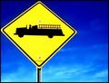
The Fire Engine Signby AnnidaComment by indigo997: HEY! I gave this an 8. I love the colors. Biggest complaint is that it goes off the left side of the frame. I like that it isnt centered but it should all be inside the shot. It's a cute sign. Very simple shot but it works for me. Yellow & Blue are Sweden's colors and my bf is swedish so ... :D
Use the full file size!! There's no reason not to, and make sure that you don't repeatedly save as jpg or you will get more artifacting b/c it loses info every time you save. Save as something else until you're all done editing. (you might know that but anyway) |
 Photographer found comment helpful. Photographer found comment helpful. |
| 02/03/2003 02:02:25 AM |
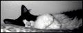
Caught Nappingby AnnidaComment by Silver Fox: Cute photograph, with what seems to be a great mood, but the photo seems to be out of focus. Don't know if it's just me. . . or not? |
| Photographer found comment helpful. |
| 02/02/2003 08:58:21 PM |
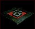
The Three Sides of Squareby AnnidaComment by mcrael: Very interesting composition - abstract, and shows creativity. I think the background is a little dark though. I'd like to see more definition on the back edges of the subject. |
| Photographer found comment helpful. |
| 02/02/2003 12:00:45 PM |
The Three Sides of Squareby AnnidaComment by PaulMdx: Composition: Near perfect, but maybe subject is a little small?
Technical: Excellent
Meets challenge: Yes
Overall impression: A really excellent pic. 9 |
| Photographer found comment helpful. |
| 01/31/2003 08:22:52 PM |
The Three Sides of Squareby AnnidaComment by Bullwinkle: I like the presentation of floating in black space and the solid rock feel of the platform. Lots of dark shadows that are eating up edge bits. That may bother some but not me. The mysterious feel is way kool. The zap of red zings up the photo nicely. The mirrors are a great idea. Interesting portrayal of subject. |
| Photographer found comment helpful. |
| 01/31/2003 03:37:23 PM |
The Three Sides of Squareby AnnidaComment by karmat: It is a touch dark and grainy, but very interesting. It is a picture that makes you want to keep looking at it to make sure you haven't missed a detail. |
| Photographer found comment helpful. |
| 01/30/2003 09:01:23 PM |
The Fire Engine Signby AnnidaComment by teachme53: The composition, and color make it a very striking image. Perhaps a little blood...just kidding. The point of view also helps the image...The low score???? I can only guess that it was because the image is very flat and gives little depth of field. Perhaps a catchier title might have helped. Although a 5.8 isn't that bad of score. Good luck on your next challenges. JG |
| Photographer found comment helpful. |
| 01/30/2003 04:55:23 PM |
The Three Sides of Squareby AnnidaComment by PTLParsons: It's too dark for me to tell a whole lot about it. I know what you are doing but I just can't quite see it. I do like how the green table fades into the black background. Awesome photo, just personally would like it a little lighter. |
| Photographer found comment helpful. |
| 01/29/2003 11:30:52 PM |
The Three Sides of Squareby AnnidaComment by thatguy: This is an interesting image. I like your use of mirrors to achieve this image. I may have tried to make it more clear, or chose a different type of lighting to get a different affect. Nice image. |
| Photographer found comment helpful. |
| 01/28/2003 07:44:40 PM |
|
| Photographer found comment helpful. |
Home -
Challenges -
Community -
League -
Photos -
Cameras -
Lenses -
Learn -
Help -
Terms of Use -
Privacy -
Top ^
DPChallenge, and website content and design, Copyright © 2001-2026 Challenging Technologies, LLC.
All digital photo copyrights belong to the photographers and may not be used without permission.
Current Server Time: 07/15/2026 09:13:18 PM EDT.