| Image |
Comment |
| 08/02/2004 02:12:52 AM |
|
 Photographer found comment helpful. Photographer found comment helpful. |
| 08/02/2004 01:06:29 AM |
Blue Fireby pmichaudComment by moodville: The centered composition works for this image and I like the subtle color of the blue. Exposure looks good too. Doesnt really have the 'wow' to it but it's a good shot. |
| Photographer found comment helpful. |
| 07/31/2004 02:01:51 AM |
Well Loved... Well Wornby pmichaudComment by ilovepinkplaydoh: i like the texture and detail of the shoes. photo could be alot stronger if the shoes filled the frame, maybe focusing on important parts. black and white might be interesting also. |
| Photographer found comment helpful. |
| 07/30/2004 04:27:01 PM |
|
| Photographer found comment helpful. |
| 07/30/2004 12:11:11 PM |
Well Loved... Well Wornby pmichaudComment by garlic: Comic. Dont know if a black or a velvet background is the right one for such a shot but maybe that´s intentional to produce some contrast effect. Could have been better lit expecially on the toas where it shows best how worn they are. |
| Photographer found comment helpful. |
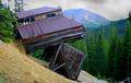
| 07/29/2004 05:19:03 AM |
After the Slideby pmichaudComment by train: Hello Patsy from the Critique Club
This is truly a balancing act.A great find. Well done for that!
Your placing in the challenge is also very good.
The only thing I think may have helped here, (in my opinion) is I wonder what this would look like in Black and white instead of the colour as that is what seems to be the problem with the D P C voters
It does look wierd around the sky level and the trees look almost too green
Maybe change to B/W and play around with the tonal range to give more dramatic effect. Although the image itself IS very dramatic
I dont think I can add much more to this A great image!
I hope my comments help if you have any questions you can P M me
Good luck in the challenges
Regards
Sally
|
| Photographer found comment helpful. |
| 07/28/2004 07:38:56 PM |
|
| Photographer found comment helpful. |
| 07/28/2004 02:43:31 AM |
|
| Photographer found comment helpful. |
| 07/25/2004 10:57:36 PM |
|
| Photographer found comment helpful. |
| 07/25/2004 02:16:23 PM |
|
| Photographer found comment helpful. |
Home -
Challenges -
Community -
League -
Photos -
Cameras -
Lenses -
Learn -
Help -
Terms of Use -
Privacy -
Top ^
DPChallenge, and website content and design, Copyright © 2001-2026 Challenging Technologies, LLC.
All digital photo copyrights belong to the photographers and may not be used without permission.
Current Server Time: 07/16/2026 06:44:45 PM EDT.