| Image |
Comment |
| 04/27/2005 08:49:07 PM |
|
 Photographer found comment helpful. Photographer found comment helpful. |
| 04/26/2005 08:06:34 PM |
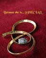
Because You LOVE herby RayEthierComment by neophyte: I like what you did here with DOF and placing the text in the out of focus area, i wish more of the necklace was in focus. You probably didn't need to get the whole necklace in but With the comp you used, you'd need a deeper field. The ring makes it crowded and seems out of place. Seperate the two or exclude the ring. I love the text and the font. It really jumps out at you. |
| Photographer found comment helpful. |
| 04/26/2005 11:51:00 AM |
|
| Photographer found comment helpful. |
| 04/26/2005 02:17:16 AM |
|
| Photographer found comment helpful. |
| 04/26/2005 02:15:00 AM |
|
| Photographer found comment helpful. |
| 04/26/2005 12:40:38 AM |
Because You LOVE herby RayEthierComment by GeneralE: If your are just going to use the one line of type, I think I'd move it up -- it feels a bit unbalanced. Good job capturing both gold and silver tones, and getting the focal place on the main subject. |
| Photographer found comment helpful. |
| 04/25/2005 10:20:25 PM |
Because You LOVE herby RayEthierComment by Brad: Reflections on the gold is always tough to control and the red reflections kind of distract a bit. Can't say as I care much for the text/font used.
Still met the challenge and composition was not as static as it could have been (not boring) |
| Photographer found comment helpful. |
| 04/25/2005 02:55:11 PM |
|
| Photographer found comment helpful. |
| 04/25/2005 12:07:45 PM |
Because You LOVE herby RayEthierComment by Beetle: Not too sure about the color of your font, but otherwise I love it (and I'm not about to vote you down for the text). I like the way you arranged the jewellery, I like your background (both color and texture), and your choice of DOF. Well done! |
| Photographer found comment helpful. |
| 04/25/2005 11:58:03 AM |
Because You LOVE herby RayEthierComment by Dr.Confuser: I like this very much and gave it a good score. You chose a nice font for this, however, I think it could be improved by changing the color of the font. The yellow overpowers the jewelry because it is so bright. Next time, try using your color picker and choosing a color already in the photo for the text. The text would then harmonize witht the photo better. You can try this without reshooting. See if it doesn't improve it. PM me if you'd like after the voting ends. |
| Photographer found comment helpful. |
Home -
Challenges -
Community -
League -
Photos -
Cameras -
Lenses -
Learn -
Help -
Terms of Use -
Privacy -
Top ^
DPChallenge, and website content and design, Copyright © 2001-2026 Challenging Technologies, LLC.
All digital photo copyrights belong to the photographers and may not be used without permission.
Current Server Time: 07/16/2026 07:05:50 AM EDT.