| Image |
Comment |
| 06/13/2005 01:09:23 AM |
|
 Photographer found comment helpful. Photographer found comment helpful. |
| 05/17/2005 10:02:01 PM |
Tourist Crossingby RayEthierComment by Ozzie: Now if my brother had seen one of those signs while driving through the Rockies 25 years ago, he would have avoided this nasty car accident he had when one of those damned Elks ran into him. Took him two years to get his short term memory loss back to normal. |
| Photographer found comment helpful. |
| 05/01/2005 12:13:24 AM |
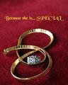
Because You LOVE herby RayEthierComment by RedOak: Interesting curvy composition and presentation. DOF is good and intriguig, colour is sharp and appealing. I'd wish for a little bit more sharpness on the ring, perhaps some more contrast as well. Text is a bit too flashy for my taste, but is non intrusive, which is good. A frame (black or dark) would do very well here. 7 |
| Photographer found comment helpful. |
| 04/30/2005 03:32:22 AM |
|
| Photographer found comment helpful. |
| 04/30/2005 02:30:28 AM |
|
| Photographer found comment helpful. |
| 04/30/2005 12:00:53 AM |
Because You LOVE herby RayEthierComment by Sonifo: I like the background color. Looks very romantic. The lighting is good, but maybe a f/11 or more to get more of the jewerly in focus. Good luck. |
| Photographer found comment helpful. |
| 04/28/2005 04:40:34 PM |
Because You LOVE herby RayEthierComment by buzzmom: i feel a bit confused while veiwing this ad ....i would have picked one piece or the other the two you chose dont compliment each other...and the focus on the chain above the ring pulls my attention...just my opinion ...g/l |
| Photographer found comment helpful. |
| 04/28/2005 01:46:07 PM |
|
| Photographer found comment helpful. |
| 04/28/2005 11:04:18 AM |
Because You LOVE herby RayEthierComment by fplouffe: I think the use of shallow DOF (which I really like) is generaly not a good idea for especially jewelry advertisement theme. I think the more detail of the jewelry, the better. It would have been better if the area just behind the ring was in focus. The choice of text font and color is debatable. |
| Photographer found comment helpful. |
| 04/28/2005 10:05:40 AM |
Because You LOVE herby RayEthierComment by glad2badad: Ok. DOF may be a bit shallow for the jewelry. I understand the concept for the fade to back. The piece in the center is almost distracting to the gold chain. Good job on the lighting and I like your choice of text (words and font style). Good luck. |
| Photographer found comment helpful. |
Home -
Challenges -
Community -
League -
Photos -
Cameras -
Lenses -
Learn -
Help -
Terms of Use -
Privacy -
Top ^
DPChallenge, and website content and design, Copyright © 2001-2026 Challenging Technologies, LLC.
All digital photo copyrights belong to the photographers and may not be used without permission.
Current Server Time: 07/16/2026 09:54:22 AM EDT.