| Image |
Comment |
| 10/12/2004 06:47:15 AM |
|
 Photographer found comment helpful. Photographer found comment helpful. |
| 10/11/2004 10:36:16 PM |
Playfulby TranquilComment by dartompkins: This is a nice photo but a bit too snapshot like. The focus is a bit off, and the feet are motion blurred. IMO, I think this would have been better if she had been coming down the slide head first. That way you could have made this a much tighter shot which would give more the impression of focusing on a feature, whether it be personality trait or physical trait, rather than the entire person. Just a suggestion. |
| Photographer found comment helpful. |
| 10/11/2004 05:27:07 PM |
Playfulby TranquilComment by nordicgirl: Its good emotion shot...still tube is so bright... could crop more of top or make half desaturation... so focuse more on girl. |
| Photographer found comment helpful. |
| 10/11/2004 03:14:59 PM |
Reflections of Summerby TranquilComment by Brad: Very nice composition here. Good use of the selective desaturation process.
One of my favorites in this challenge ! ((8)) |
| Photographer found comment helpful. |
| 10/11/2004 03:05:58 PM |
Playfulby TranquilComment by phoensoul: This is a good shot. To be picky, I'd say that the sameshot, but with the eyes a bit wider, the feet still, and the horizon level would be perfect. Good composition and concept. The white balance looks a bit too blue, but that can be forgiven because of all the blue in the shot, which would give a blue cast with film as well. |
| Photographer found comment helpful. |
| 10/11/2004 10:26:54 AM |
|
| Photographer found comment helpful. |
| 10/11/2004 01:11:06 AM |
|
| Photographer found comment helpful. |
| 10/10/2004 12:21:48 PM |
Reflections of Summerby TranquilComment by photom: Nice use of selective desat. Looks more like Autumn than Summer. I like the mysteriousness of the text on the right, but don't like the feather (or whatever it is) shape on the left edge middle. Message edited by author 2004-10-13 15:07:54. |
| Photographer found comment helpful. |
| 10/08/2004 09:56:00 PM |
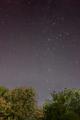
The Universeby TranquilComment by DarkRider: Hi Lee,
Scott here from the Critique Club,
I think your concept for this challenge was wonderful. The star trails look a little blurry....even for showing motion trails. I'm going to guess that your tripod was either setup on an unstable surface or that there may have been some wind when this photo was taken. I'm more likely to guess the latter looking at some of the motion in the tree tops. When I have taken night sky pic I try to keep my tripod legs close to the ground and widen them further then normal for a lower center of gravity. If you where setup on a surface like a wooden deck just the motion of walking to and from the camera may have caused some shake. If knowing I had a little light pollution in the pic I may have tried taking the pic later or at a different location. I got a sense from your comment on this pic that you thought it might have some negative effect.
The tree line looks like it shows some side effects of editing and doesn’t feel like it blends well with the sky. Replacing the tree line with a solid more stable foreground subject may have helped. By adding a little clarity and some scale to your pic. I find the larger the object to compare the sky to just makes the sky that much bigger and would have added to your “The Universe” title.
I had a good look through you profile and see some definite improvements in subject, composition, and clarity from your early challenge entries. I also really like your B&W work in your prints folder. Keep up the good work. If I’m right I think that your pics that generally do better in challenges are the ones you are more comfortable shooting. More like your profile pics. May I suggest not trying so hard for challenges and let your natural eye take the pic. (Don’t take that the wrong way-trying new things is a great way to improve) Just don’t second guess yourself. If your have any questions or comments please feel free to PM me.
Scott.
|
| Photographer found comment helpful. |
| 10/07/2004 05:40:22 PM |
Reflections of Summerby TranquilComment by DCThiessen: What a great idea, and I think the selective saturation works very well with the title of your photo as it draws the viewer's eye to the reflection. |
| Photographer found comment helpful. |
Home -
Challenges -
Community -
League -
Photos -
Cameras -
Lenses -
Learn -
Help -
Terms of Use -
Privacy -
Top ^
DPChallenge, and website content and design, Copyright © 2001-2026 Challenging Technologies, LLC.
All digital photo copyrights belong to the photographers and may not be used without permission.
Current Server Time: 07/18/2026 07:49:32 AM EDT.